National Geographic: What the World Eats
2014
research, data analysis, ux design
research, data analysis, ux design
Data visualization for National Geographic’s Future of Food online feature, showing diets across countries and time. Made as part of a team at Fathom Information Design.
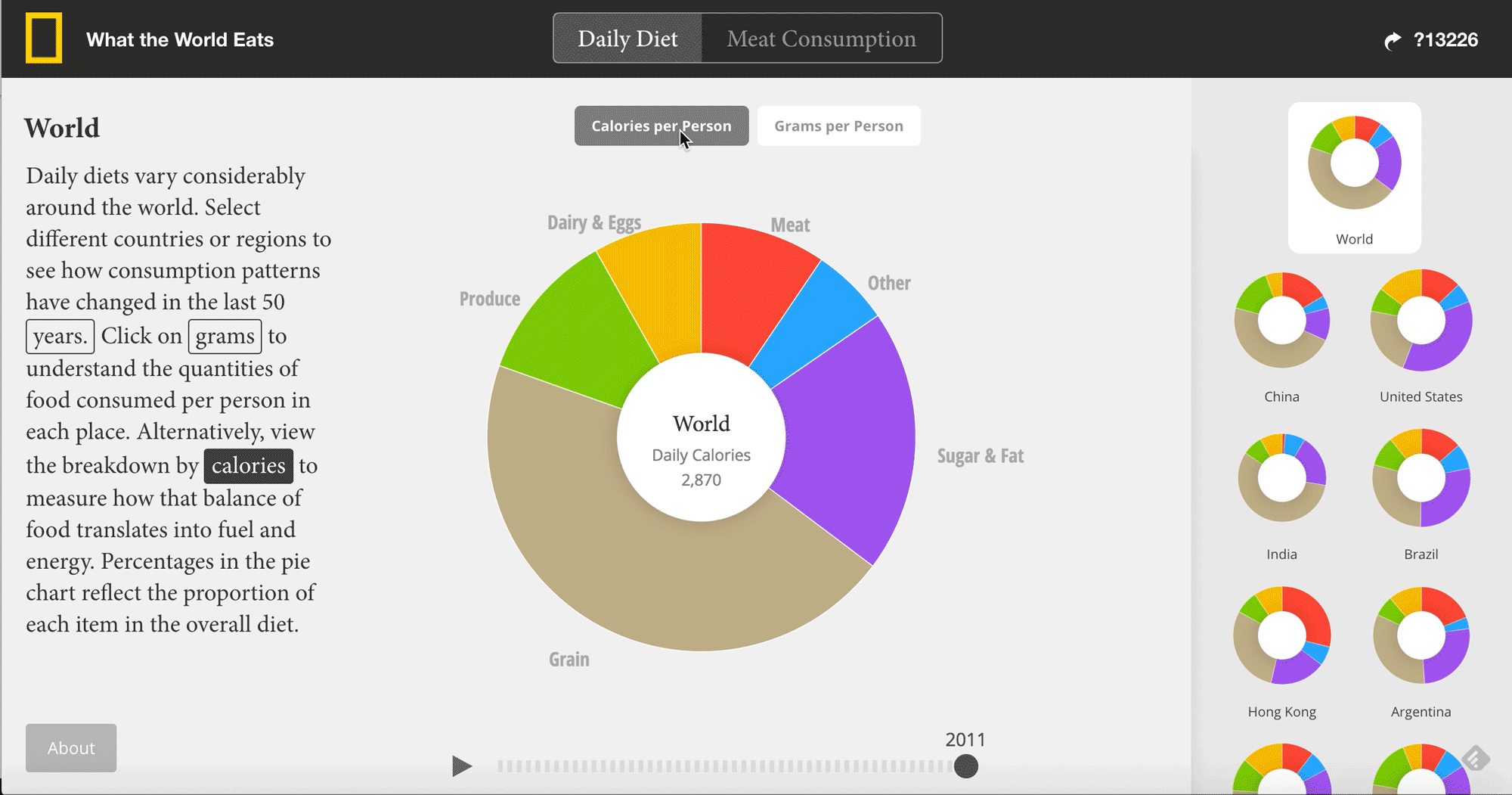
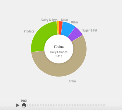
The food we eat is not only an intimate reflection of our identity, it's an indication of the greater social, political, and environmental forces that shape our lives, depending on where we live. Our team at Fathom was hired to tell the story of what the world eats through data, for National Geographic's Future of Food series.
The UNFAO publishes a number datasets on the trade, utilization, and consumption of food, broken down in every way you can imagine. Although this information is public and pertinent to pretty much everyone in the world today, the sheer amount of information makes it less accessible. We parsed the data to find interesting stories and ways to make it more immediately engaging.

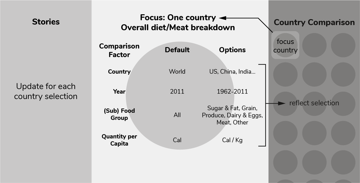
To quickly get a meaningful visual overview of the data, I helped build a number of prototypes using Processing. The prototypes both gave us handle on all the data and informed the design of the final interactive visualization.