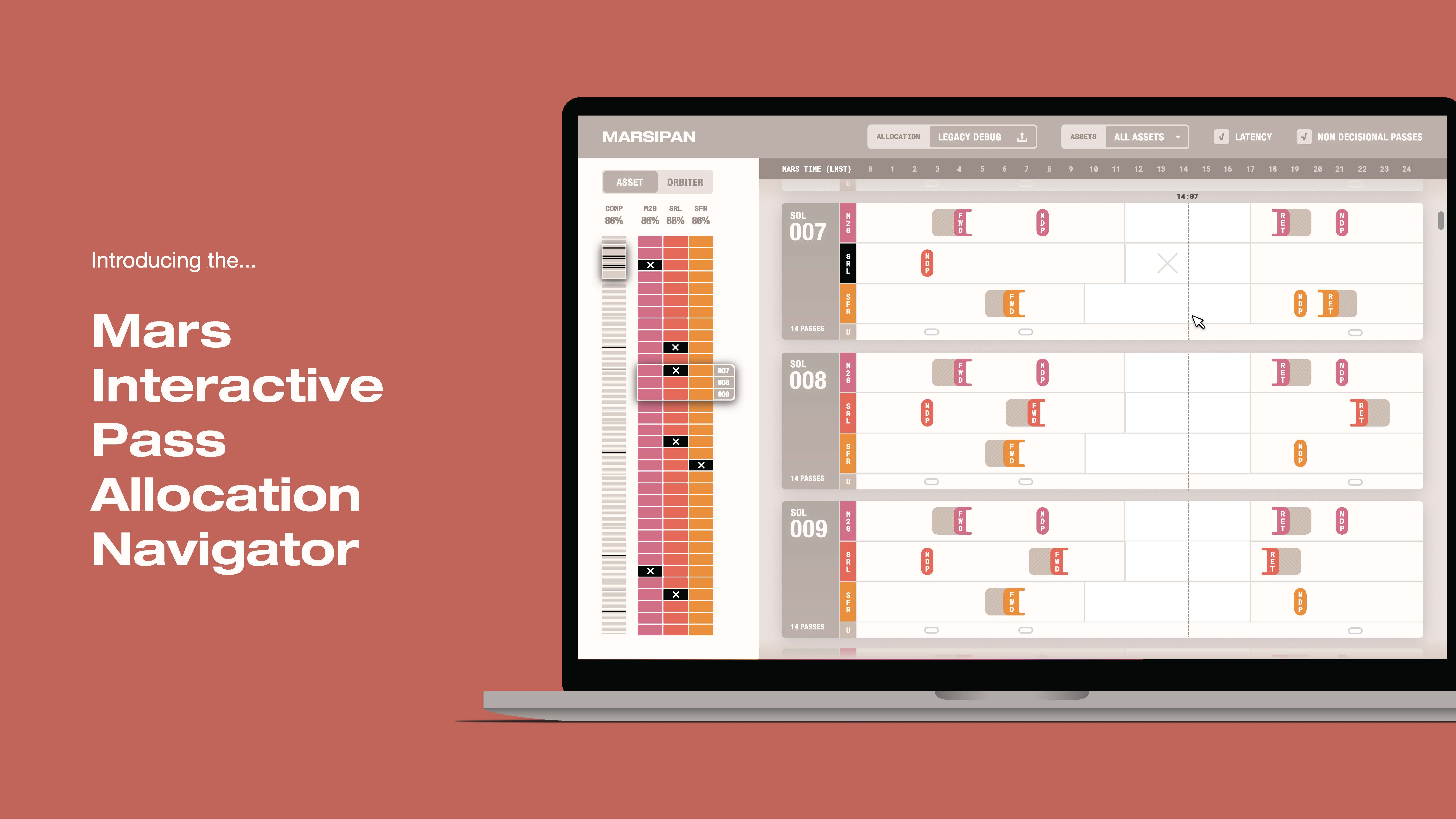
Mars Interactive Pass Allocation Navigator (MARSIPAN)
2021
contextual inquiry, user testing, wireframing, data sketches (p5.js), ux design
contextual inquiry, user testing, wireframing, data sketches (p5.js), ux design
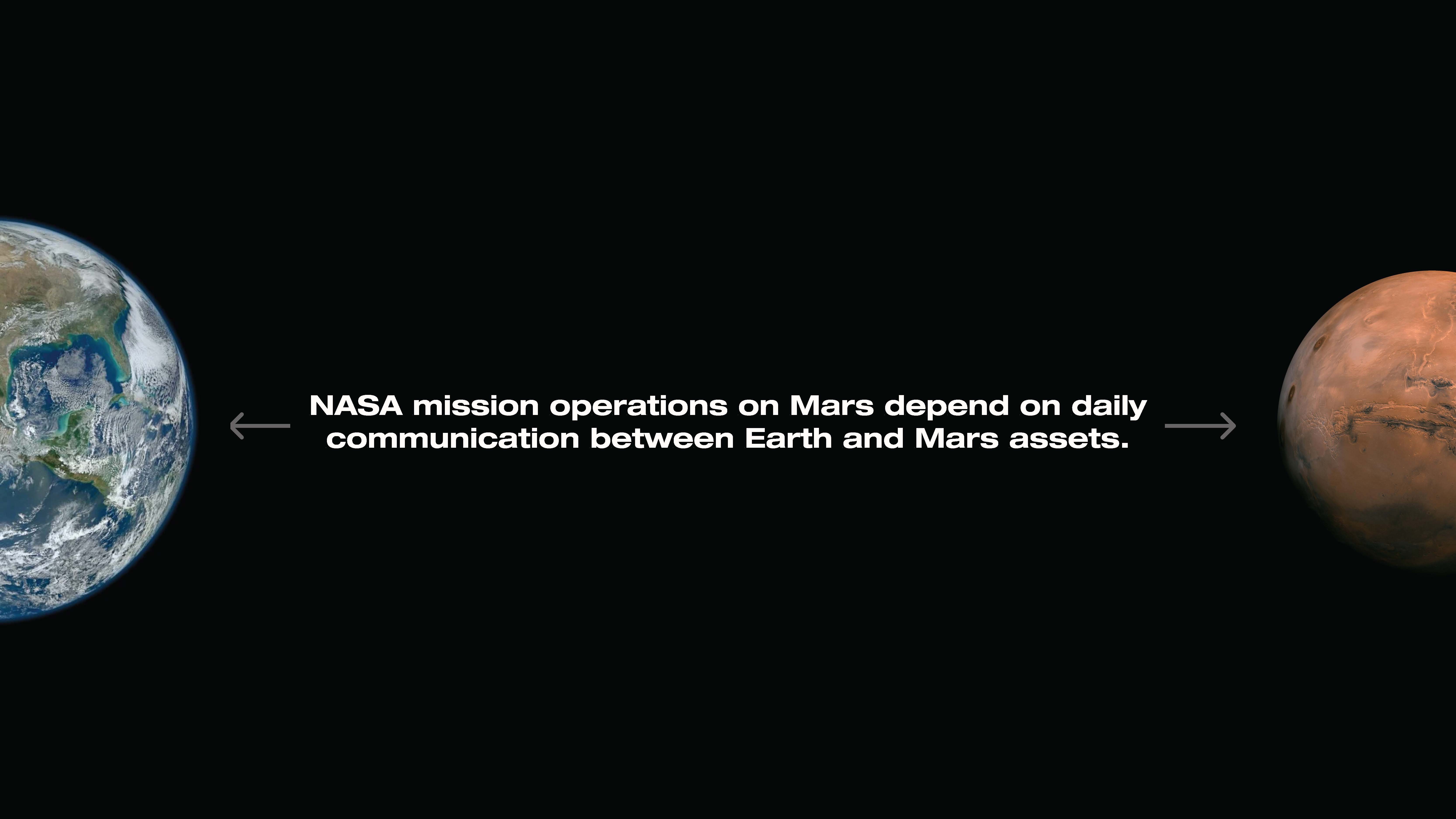
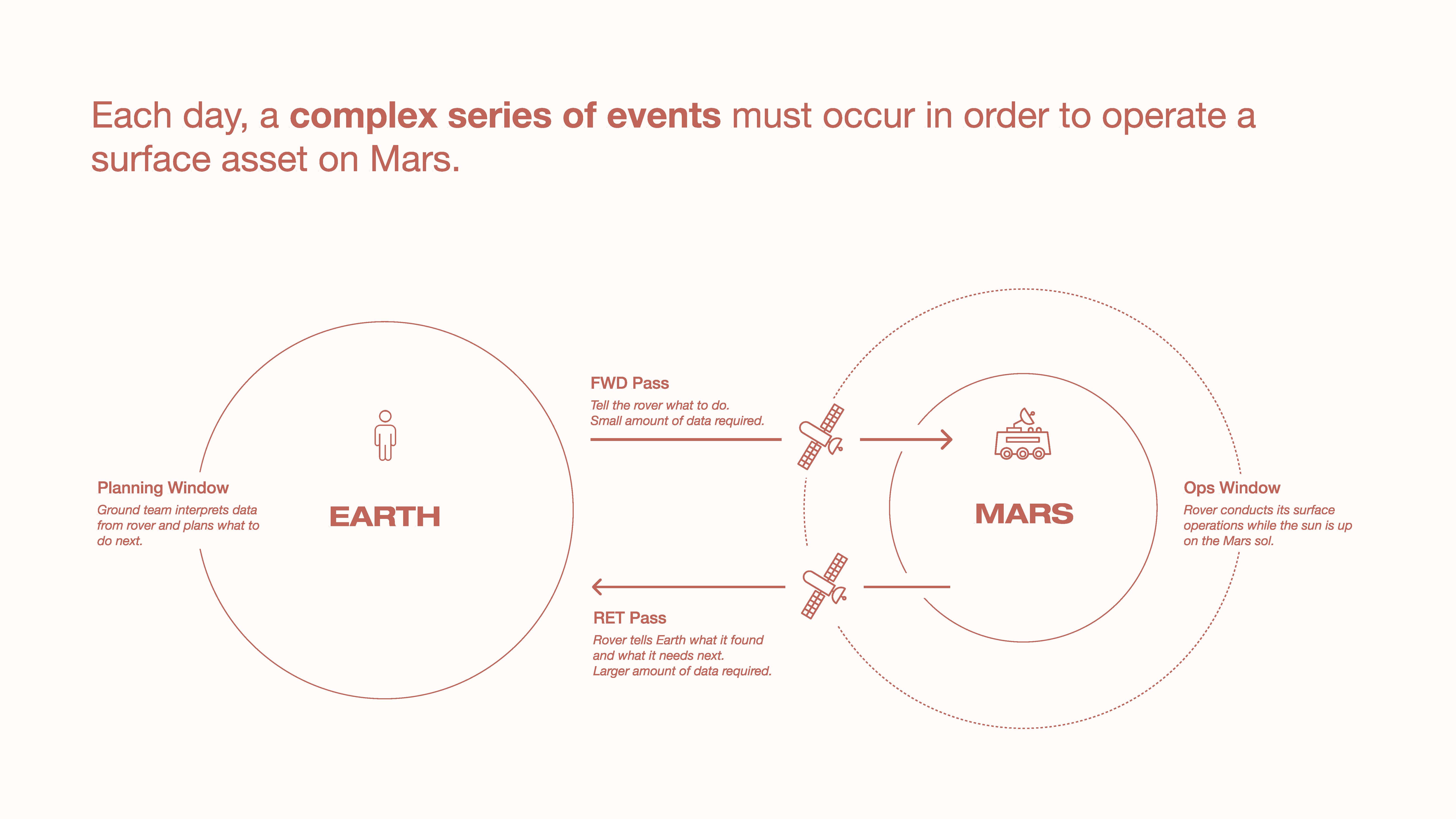
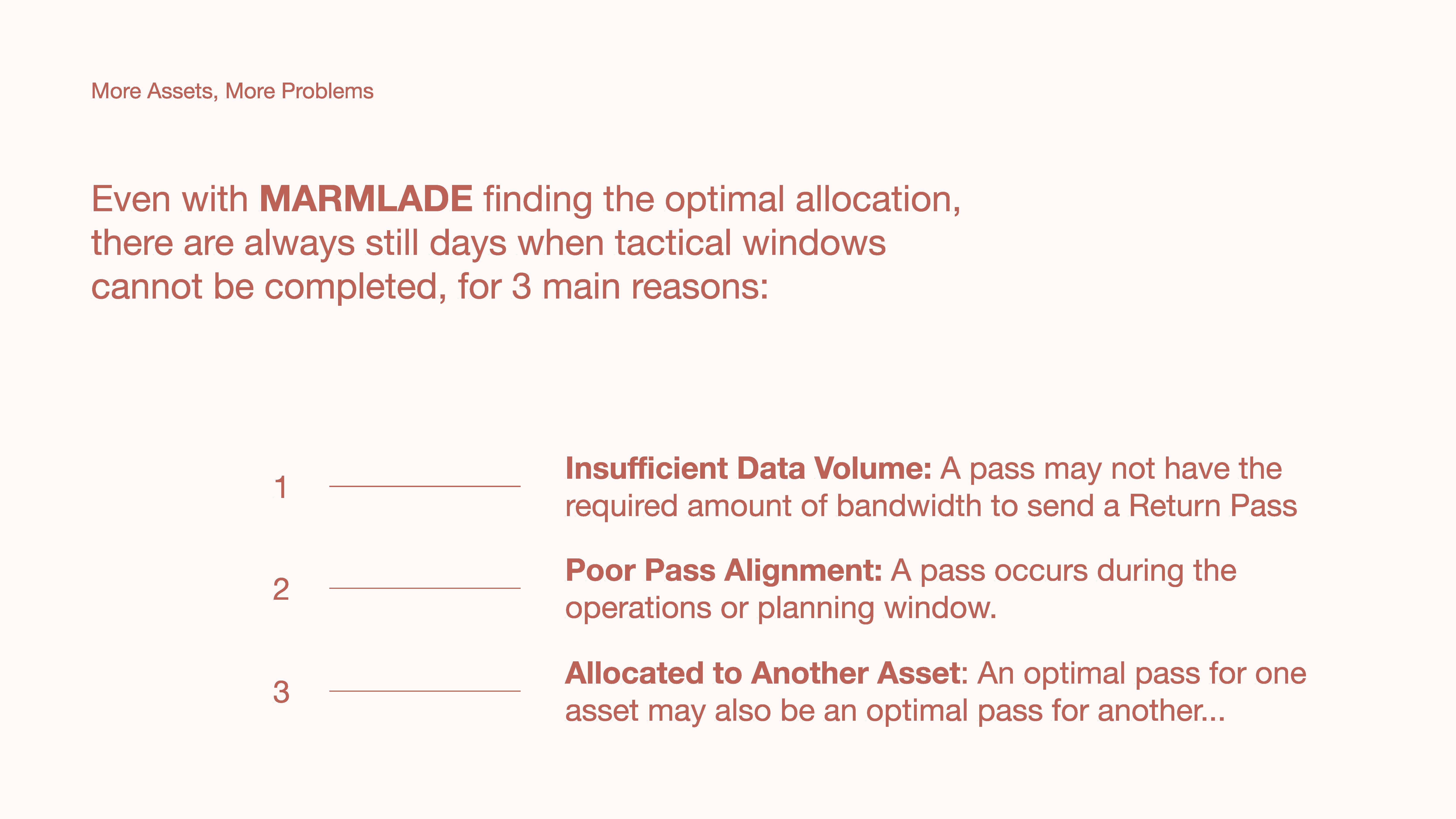
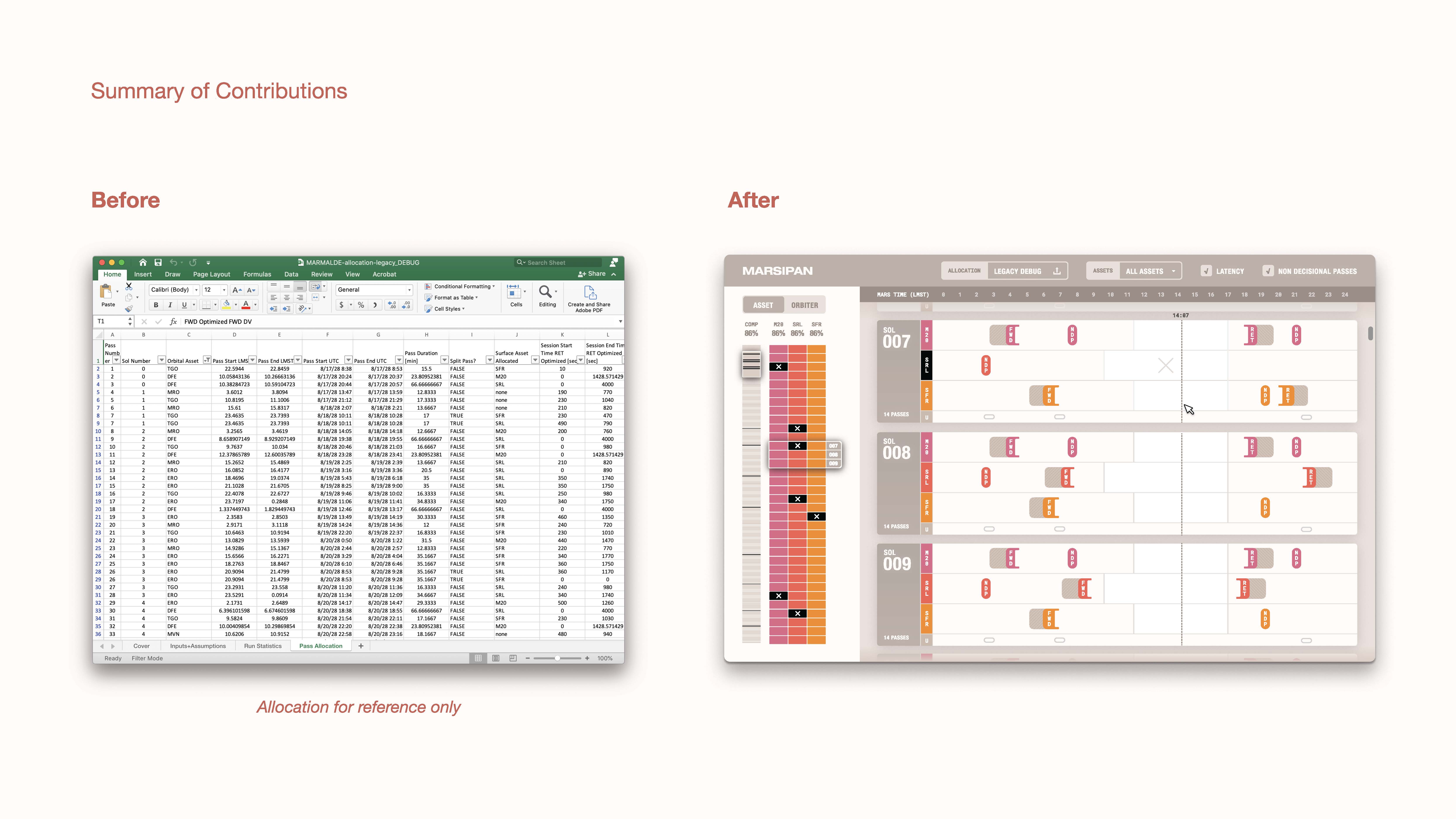
During the summer of 2021, I designed a tool for NASA to visualize, diagnose, and navigate pass allocations: the planned communications between rovers and satellites on Mars, back to Earth. I worked with a team of engineers at NASA’s Jet Propulsion Laboratory, along with another designer and developer through the Data to Discovery Program. We are currently continuing to develop the tool to provide more functionality and integration with existing workflows.


Formlabs Form 3
2017
physical computing, signal processing, prototyping
physical computing, signal processing, prototyping
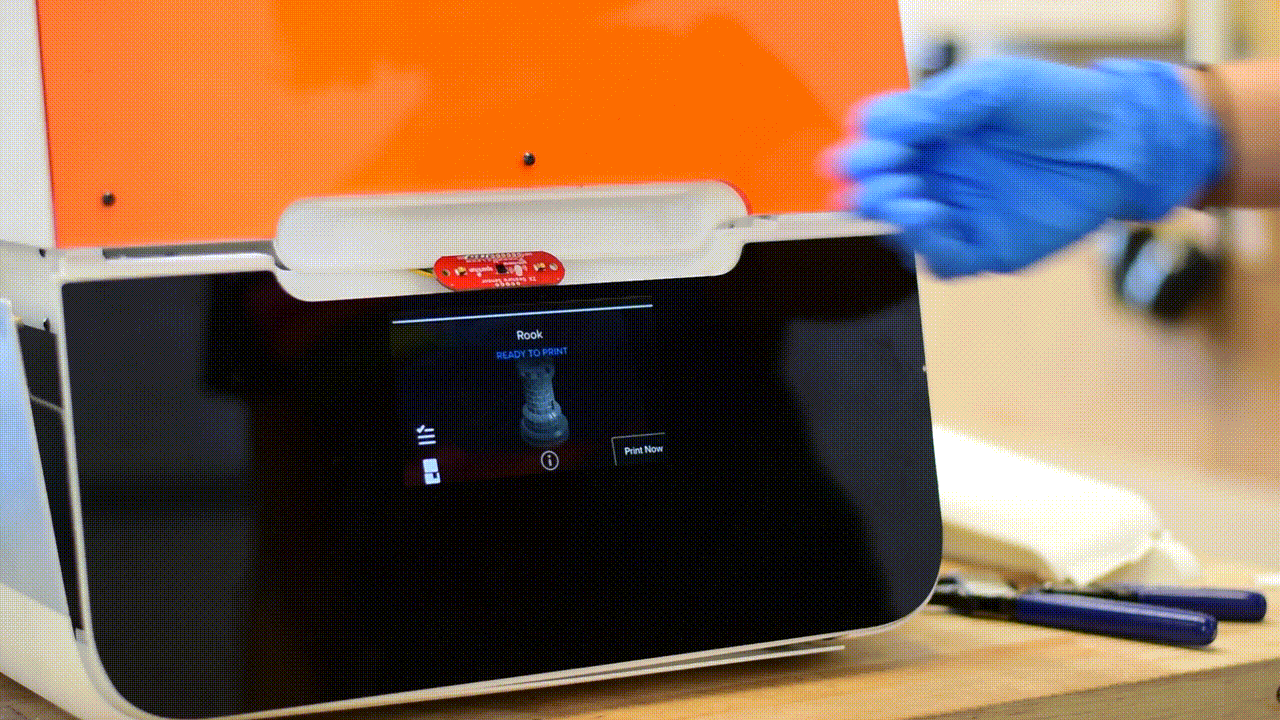
While working as an interaction designer at Formlabs, I designed and prototyped experimental light, sound, and proximity interactions for 3D printer UIs.
Light and sound are used to call the user’s attention to critical machine status updates from afar, while proximity sensors allow the graphic touchscreen interface to switch to “far-field” mode when the user is too far to read the display. The graphic interface calls the user’s attention when necessary, and otherwise shows status as a background message.
Light and sound are used to call the user’s attention to critical machine status updates from afar, while proximity sensors allow the graphic touchscreen interface to switch to “far-field” mode when the user is too far to read the display. The graphic interface calls the user’s attention when necessary, and otherwise shows status as a background message.


Prototyping

UX Design


Unravel Calendar
2022
concept, design, fabrication
concept, design, fabrication
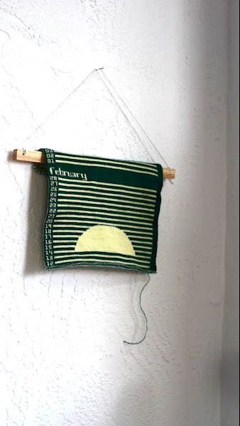
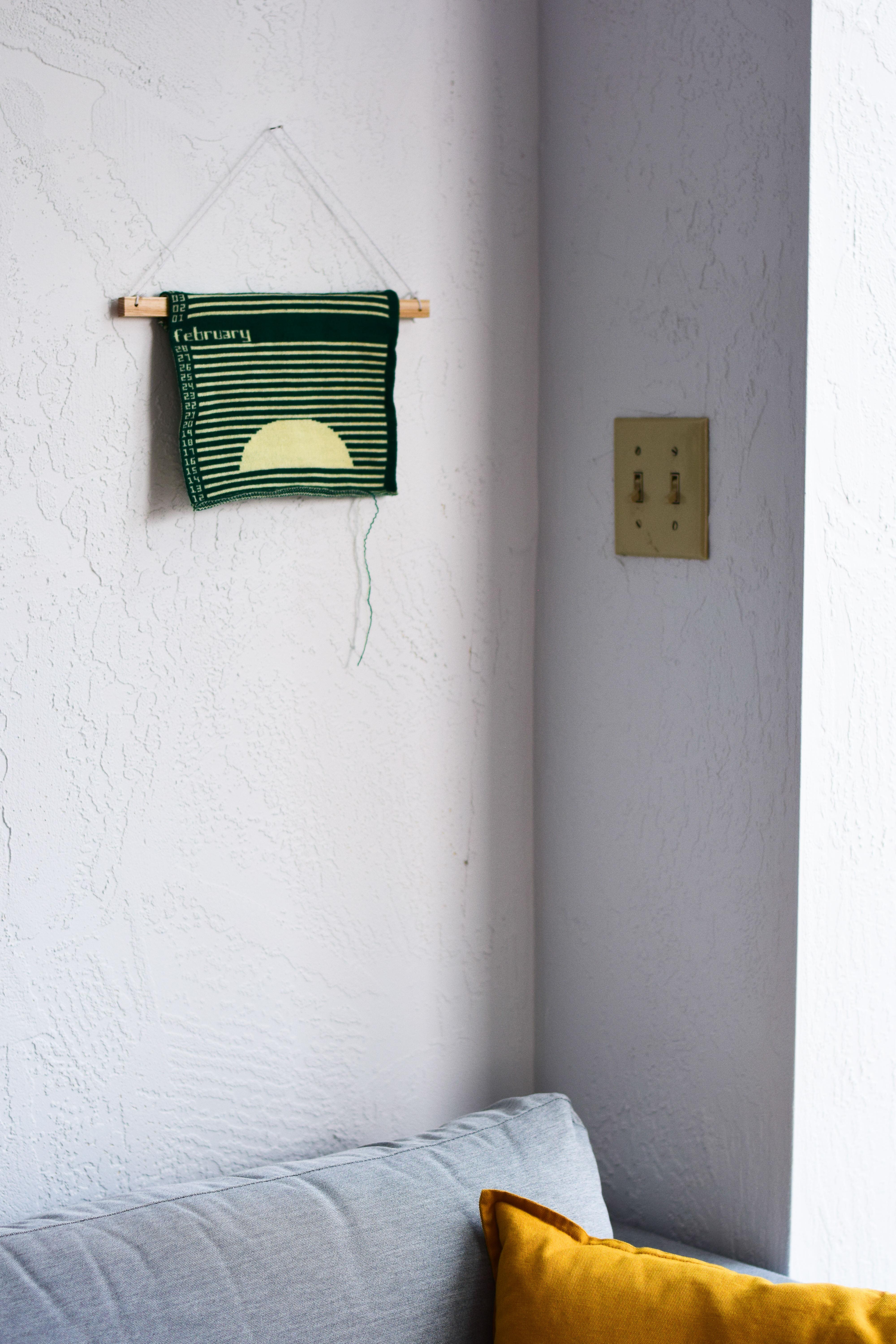
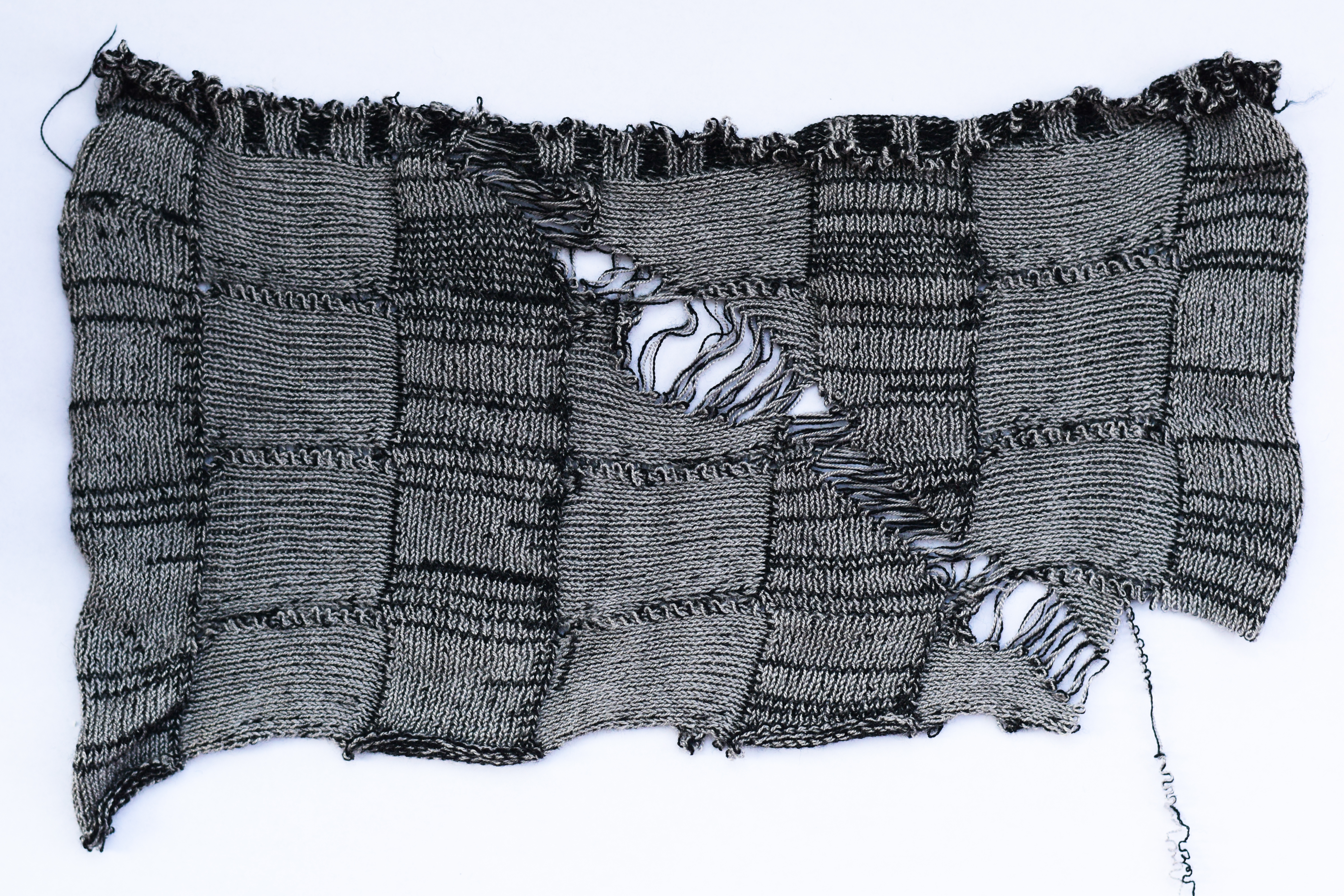
The Unravel Calendar is a 12-month Gregorian knit calendar made entirely of yarn, representing time through rows of stitches. Each day, the user pulls a loose string to unravel that day of the calendar back into yarn: an embodied ritual that creates an opportunity to slow down and actively reflect on material transience and the human experience of time. The calendar leaves the user with a spool of yarn at the end of the year that they may make into another knit artifact.
The Unravel Calendar proposes a material philosophy of products that are made to be unmade. This approach builds on sustainable design movements including design for disassembly, cradle-to-cradle, distributed making, and emotionally durable design. The Calendar is made from a single material that the user disassembles into its usable “raw” form simply by interacting with the object over time. The user can recycle the yarn themselves without special equipment, leveraging the accessibility and latent knowledge of knitting as a domestic and distributed method of making. The yarn is embedded with the memory of the year, carrying its material significance into the next phase of its life as a sweater or blanket.
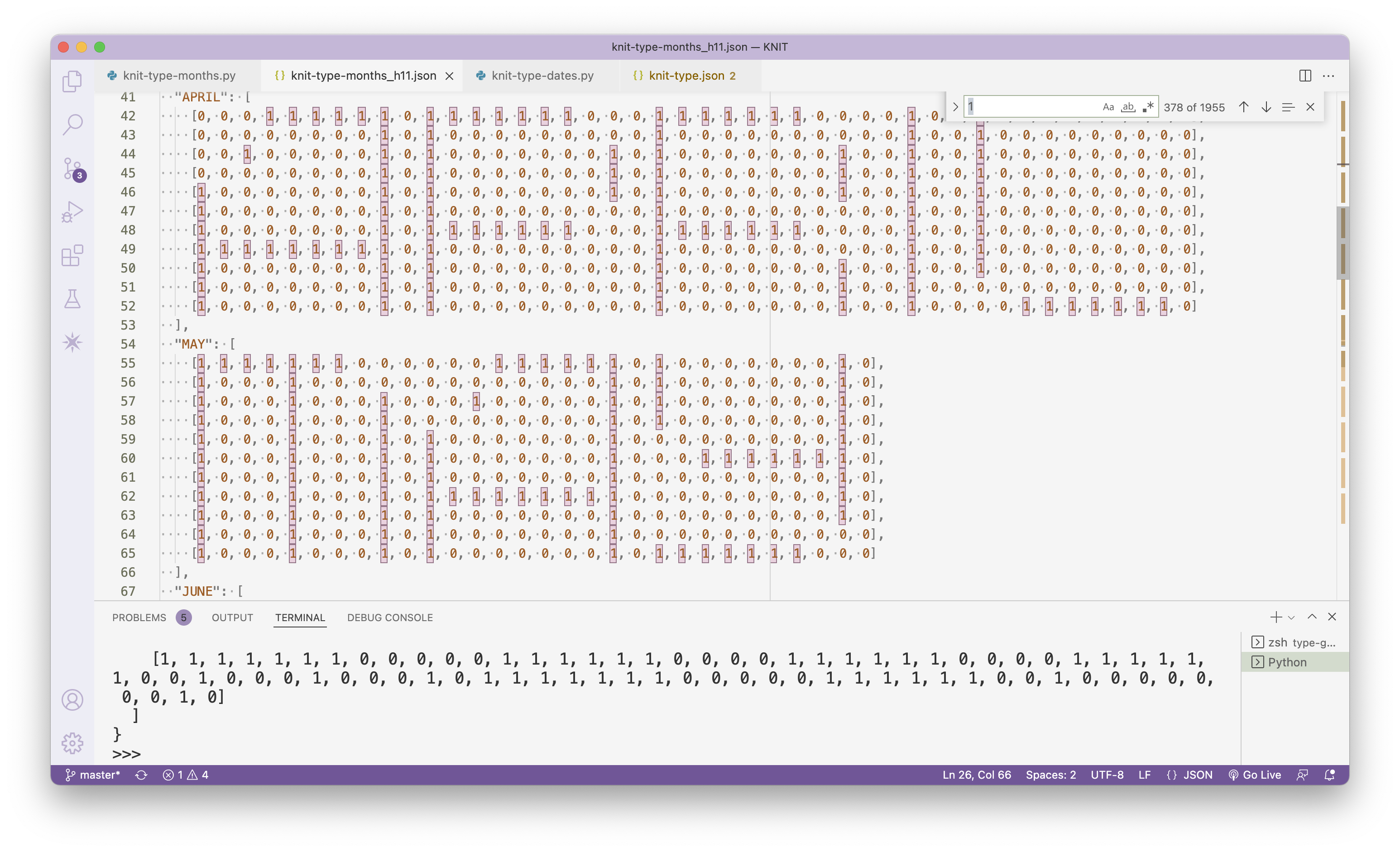
The weeks and months of the Unravel Calendar read bottom-up, so January 1 is at the bottom of the calendar. This is so that the calendar can be hung with the unraveled end on the bottom. Each day in the calendar is made up of 1440 stitches, one for each minute of the day.
Process
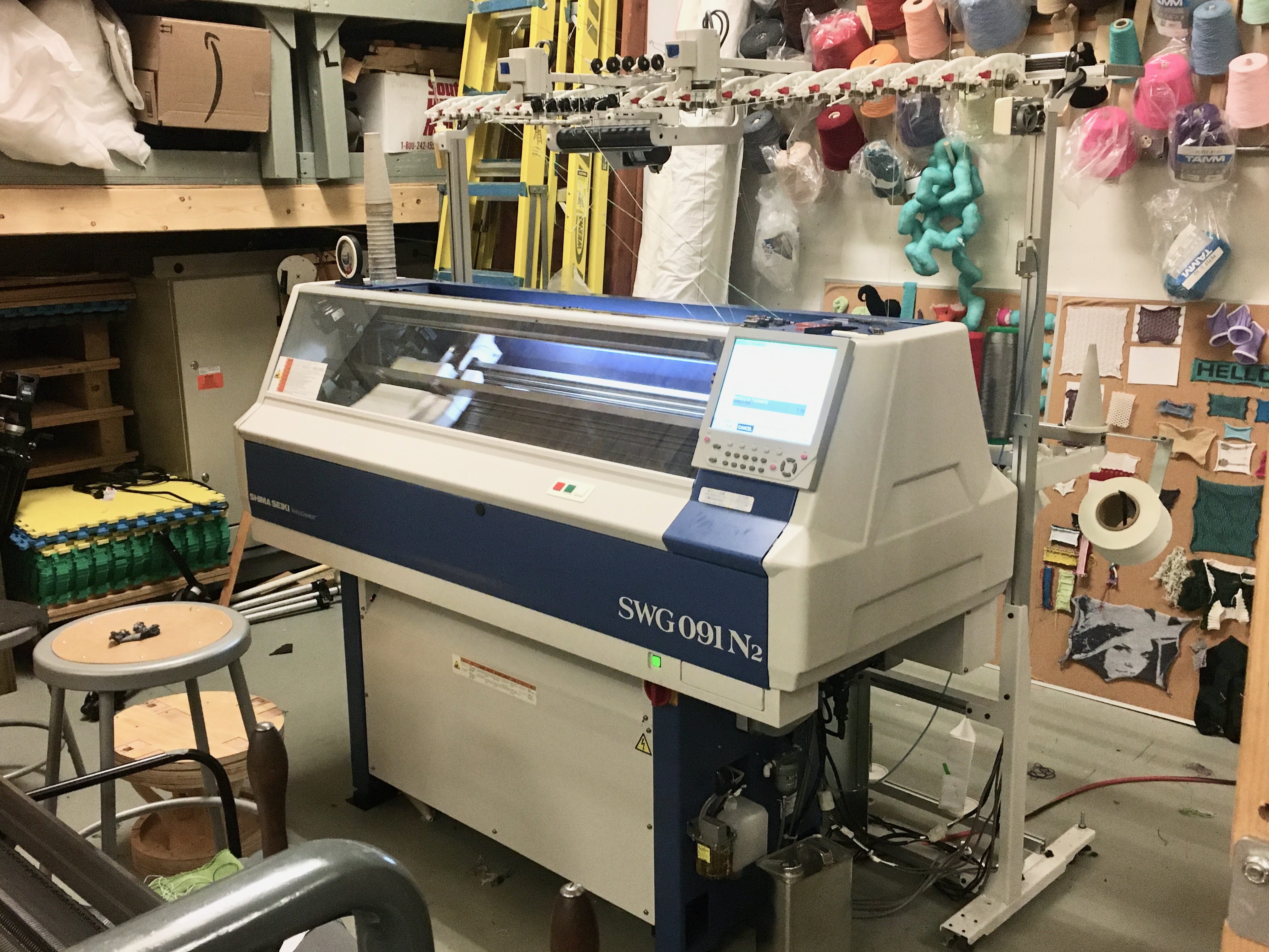
I knit the calendar using a tubular jacquard technique with two colors of yarn on a Shima Seiki industrial knitting machine. I created a custom pattern for the machine using knitout, a file format created at the Carnegie Mellon University Textiles Lab to represent low-level knitting instructions like “knit on needle 151 with yarn 1 going right to left,” much like how G-Code provides instructions to a CNC machine tool. I designed and wrote a program in Javascript that generates the knitout instructions for the full calendar in two colors.
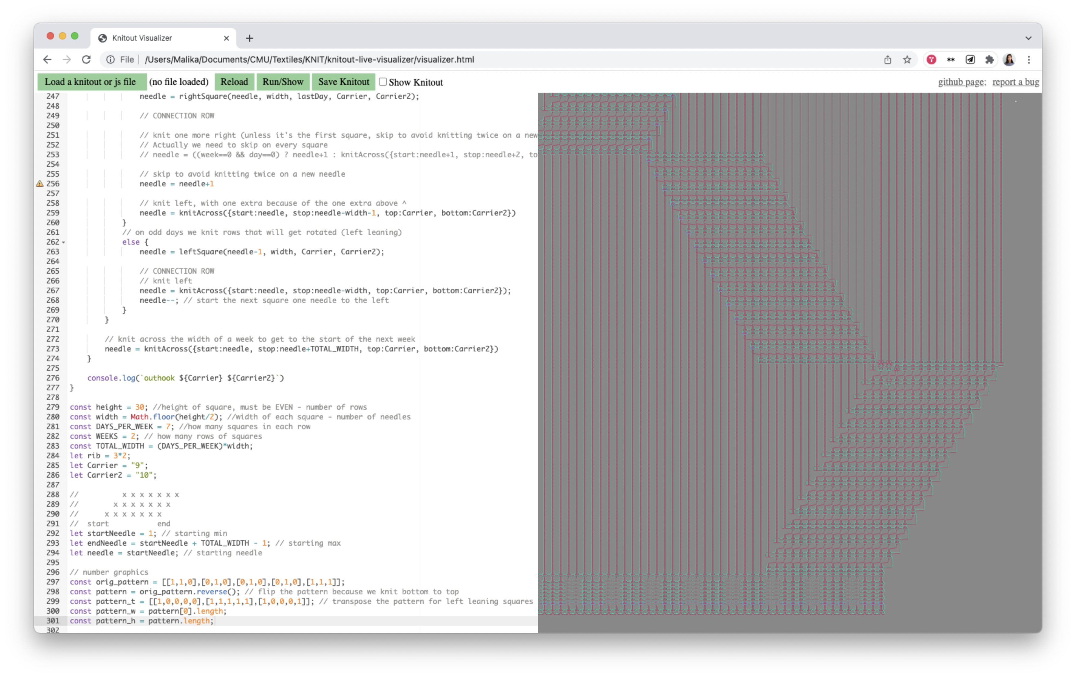
The first iteration of the calendar followed the conventions and layout of a typical desktop calendar, with knit squares representing days, arranged in rows of weeks, which in turn make up blocks of months. When one square unravels, it feeds into the next square to its right. Because knitting typically is done in rows back and forth, I put a lot of time into designing the knit pattern to allow one day-square to unravel into the next day beside it. The pattern is a variation on the entrelac knitting technique, which involves a number of complex operations that are further complicated by incorporating two colors. As a result, for the final iteration I returned to a simpler layout where days are knit as rows spanning the full width of the calendar.
Formlabs Fuse 1
2017-2018
user testing, ux design, visual design
user testing, ux design, visual design
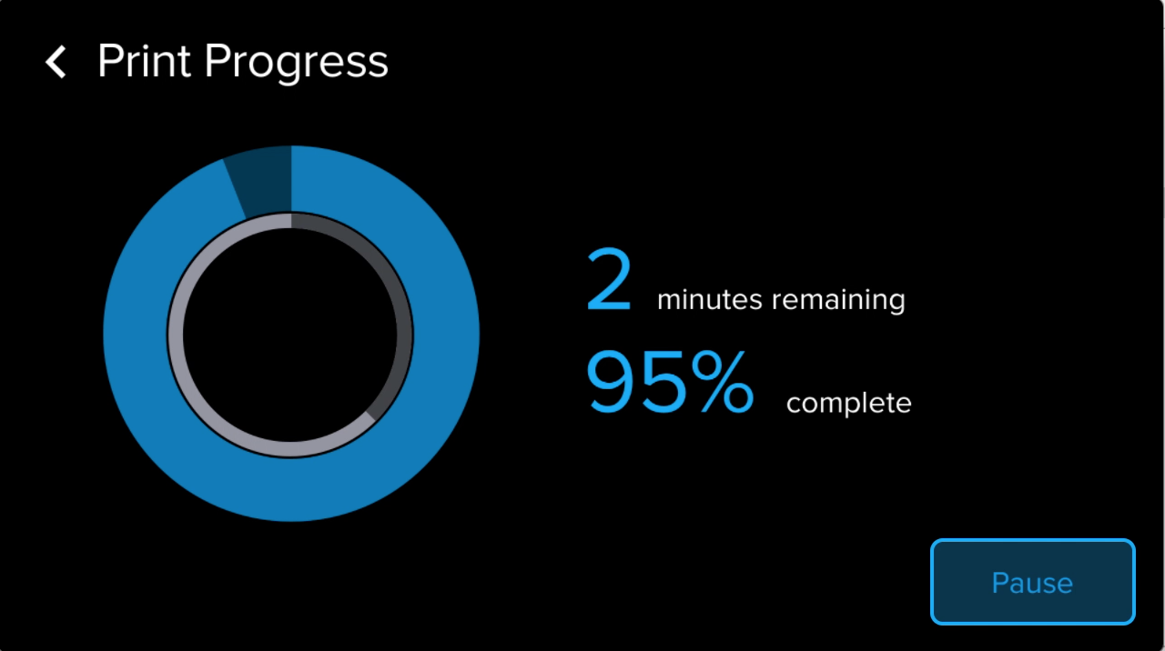
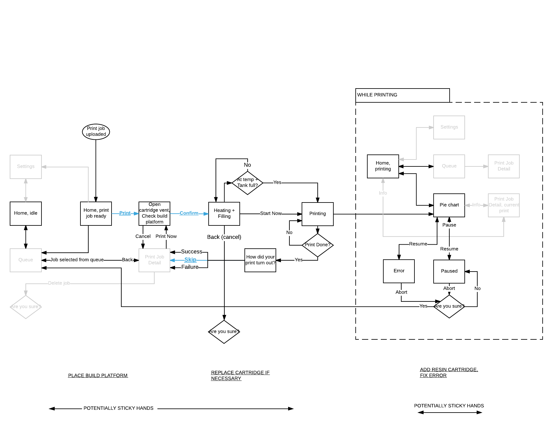
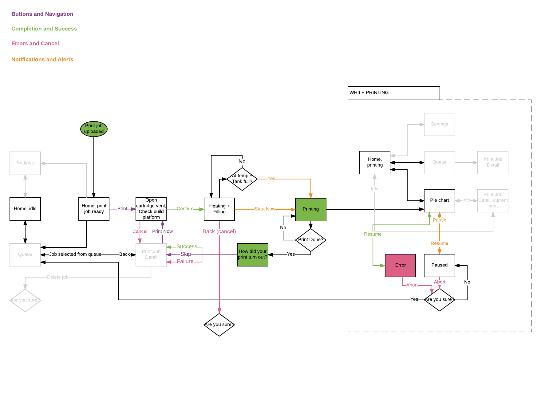
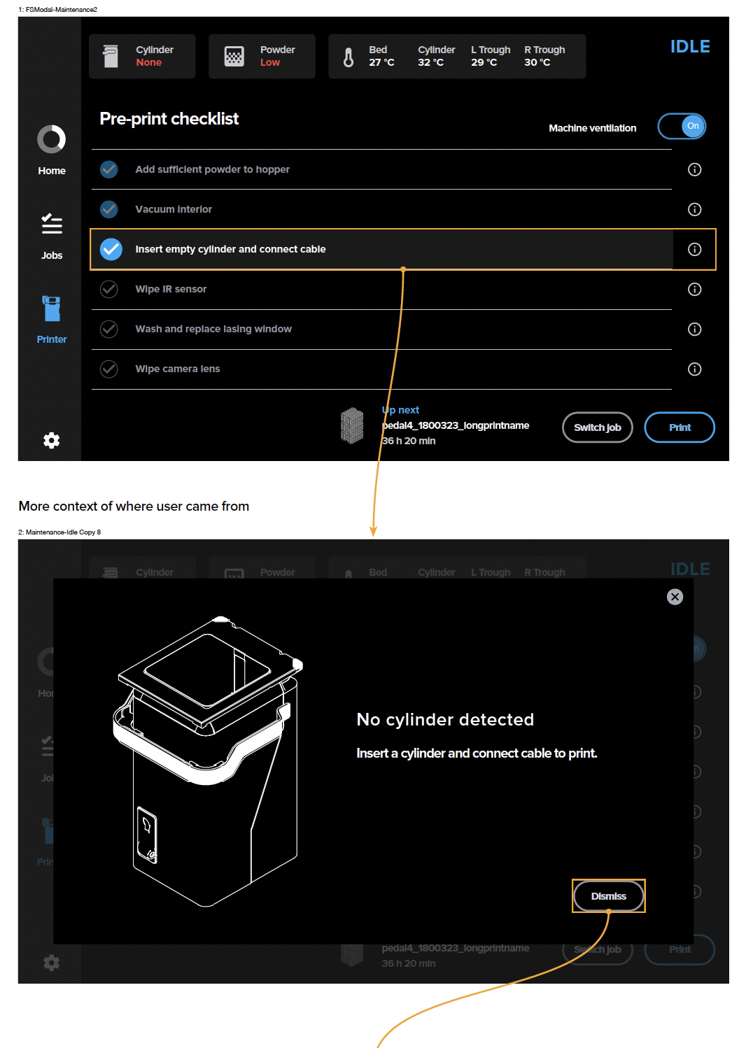
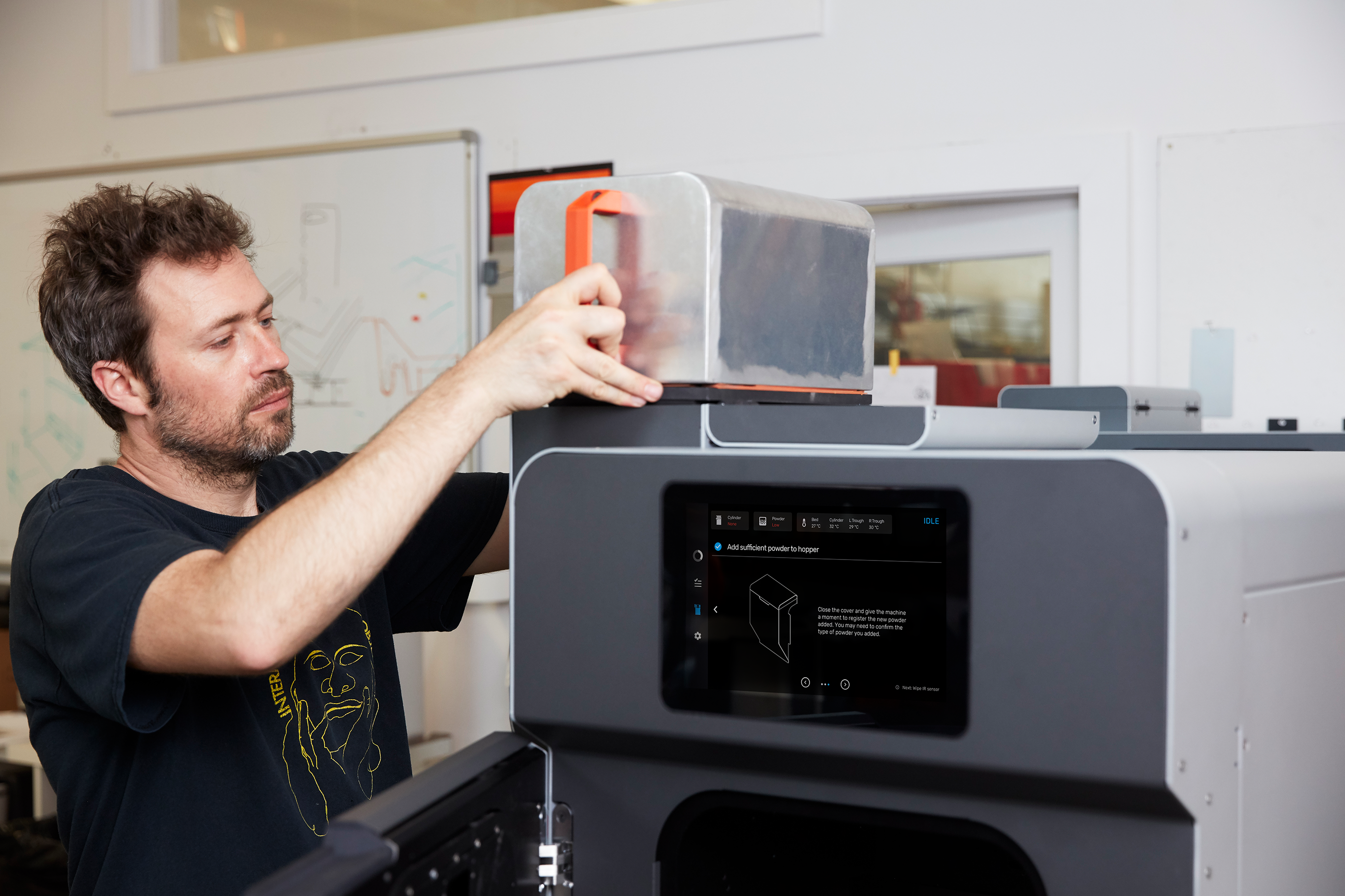
A touchscreen interface for Formlabs’ SLS 3D printer that allows users to monitor the progress of active prints and overall printer status, queue new jobs, and change system settings. I was the design lead on the project, working closely with engineering and industrial design teams to select components and understand necessary sensor data to communicate through the UI.
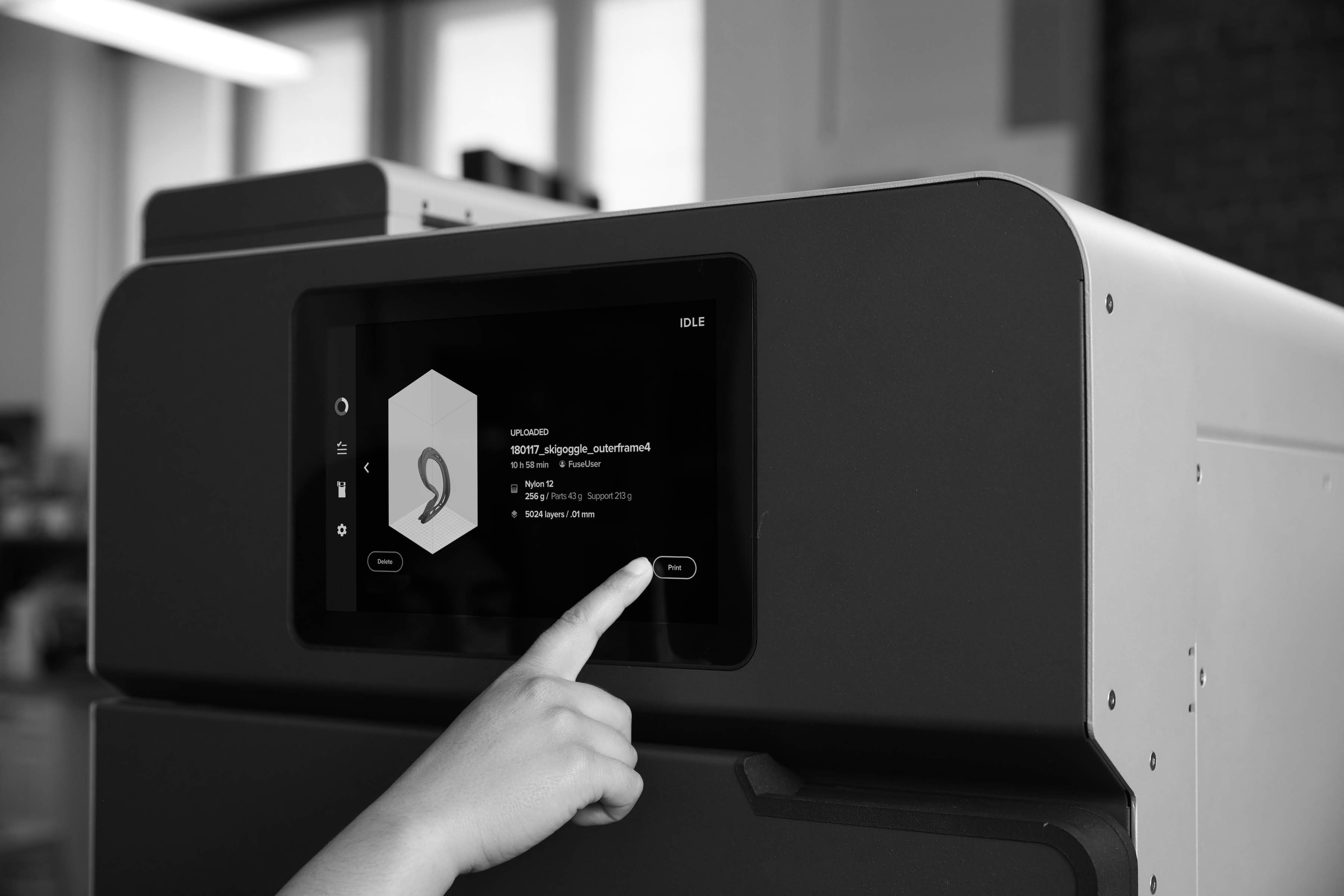
Key constraints were to provide flexibility in the printer maintenance workflow required between every print, and to always give the user access to the live feed of the print bed.
I wireframed three navigation structures: side navigation, heads-up display, and cards. I built interactive prototypes using Principle and mounted an iPad on a printer model to conduct user tests.
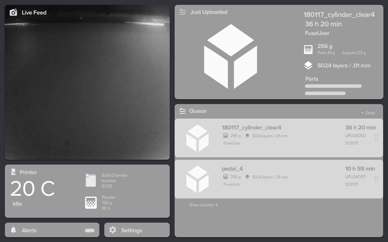

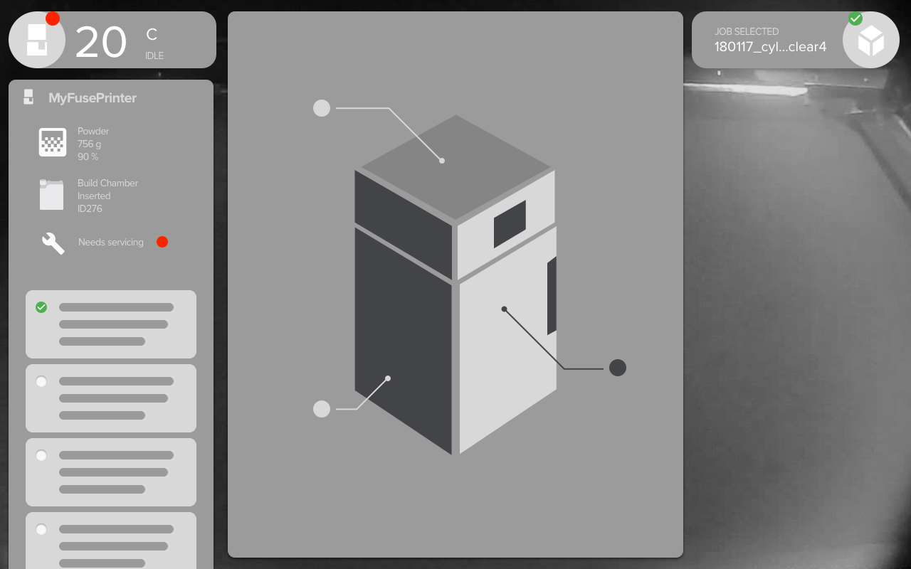
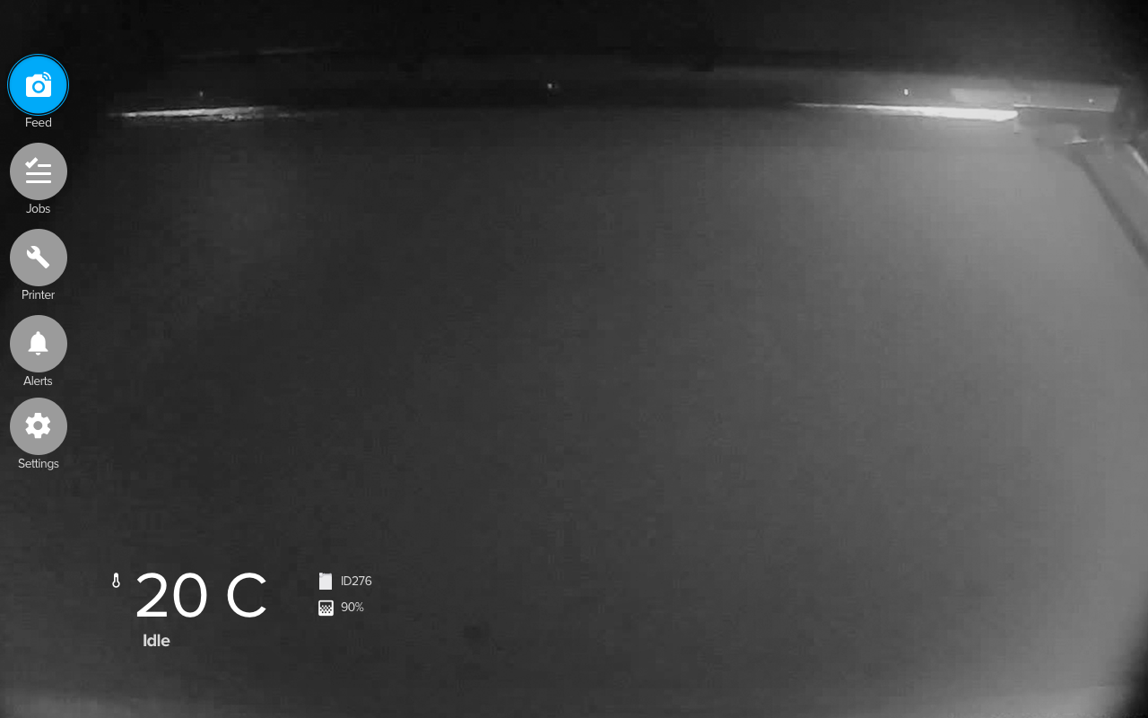
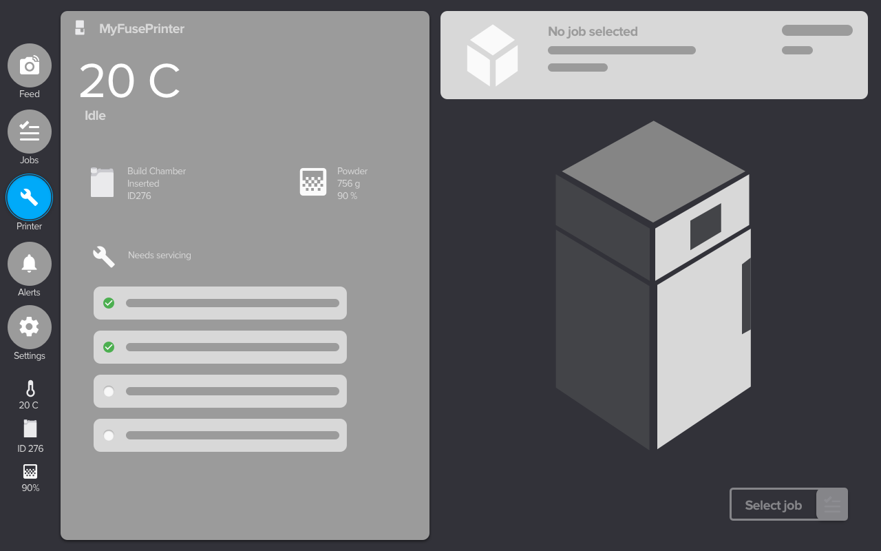
The side navigation structure was the most familiar and intuitive for all users. I created a maintenance checklist accessible at any time through the navigation bar, and before printing.
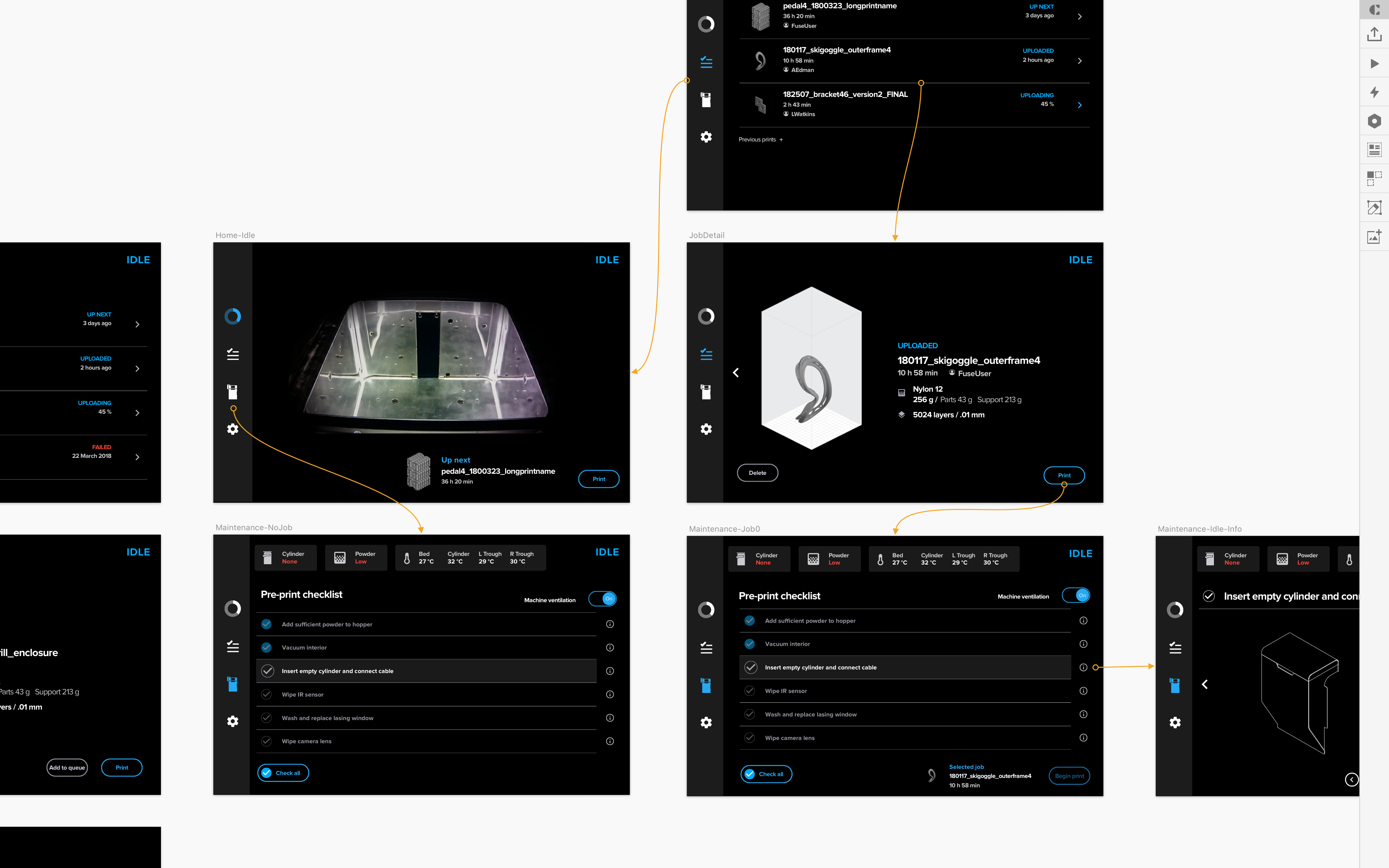
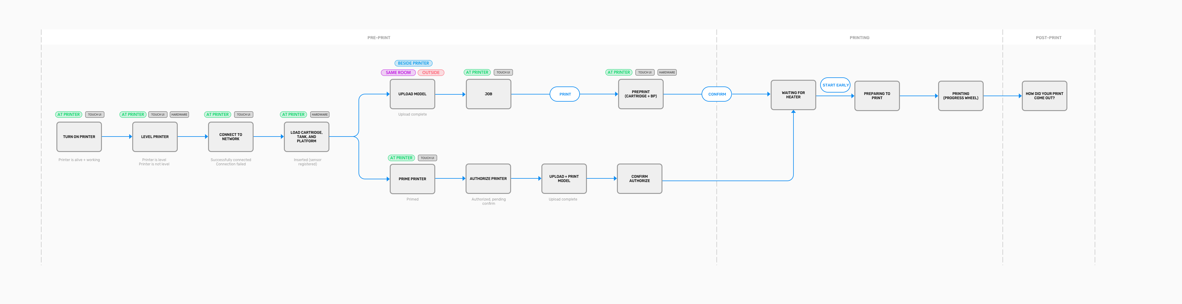
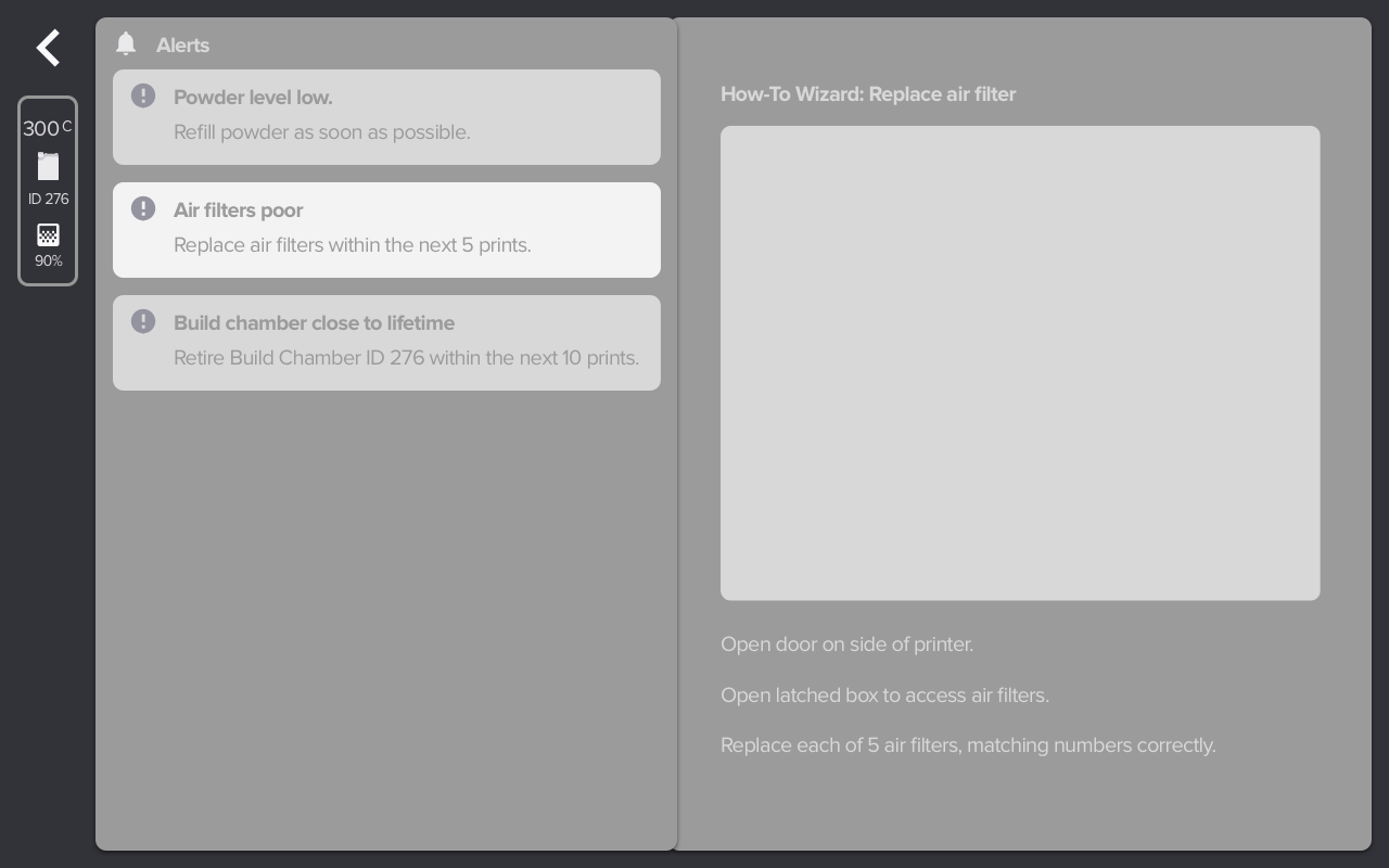
Case Study: Alerts
One area I especially focused on was mapping all system alerts, starting from sitting down with the engineering team to understand the machine sensors and error/failure states and condensing those error states into categories.After wrapping my head around all the possible alerts, I developed a hierarchical system to reflect the urgency of the alert.
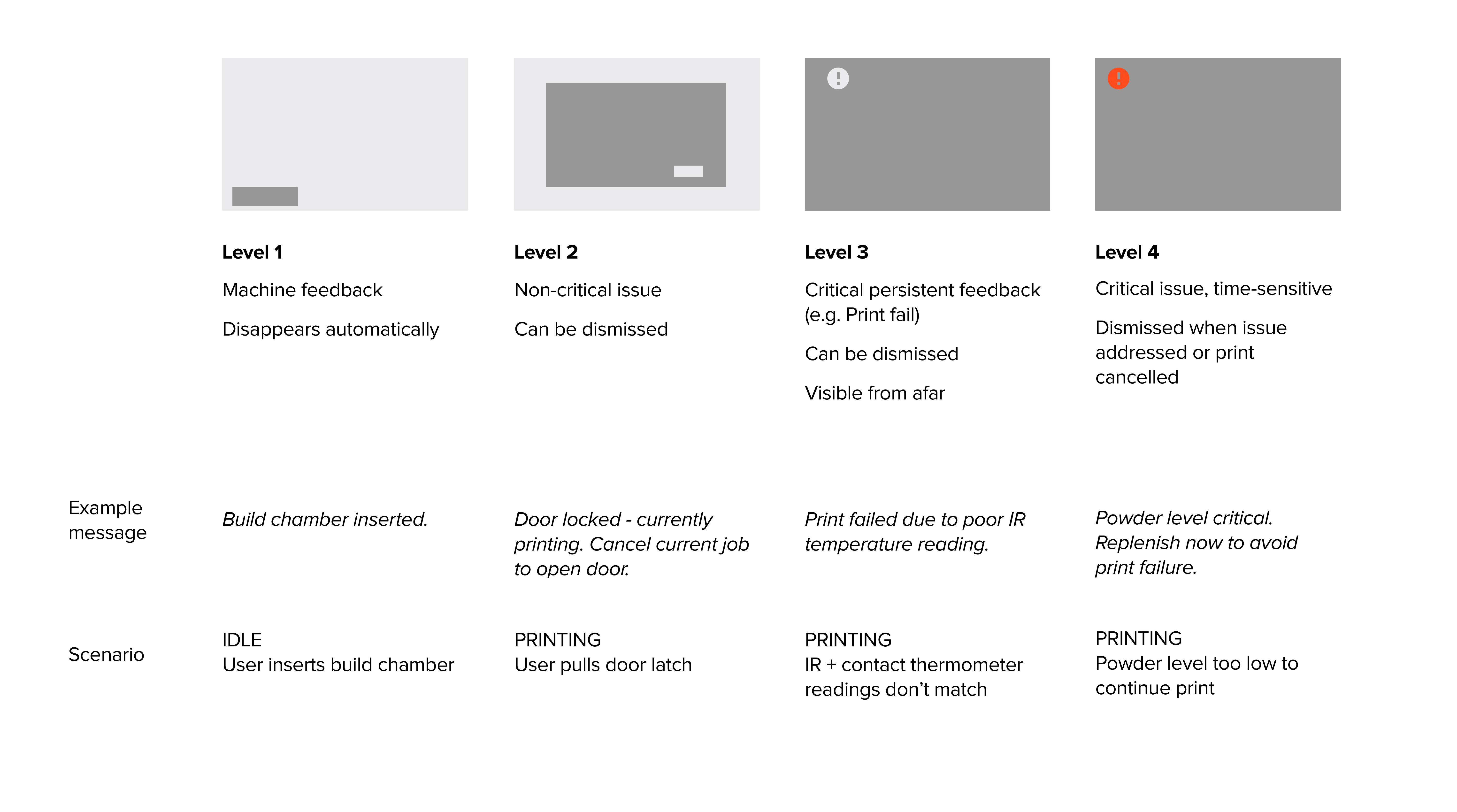
I brought this hierarchy together with my more technical understanding of the machine to map flows that incorporated user actions, machine state, and UI guidance.

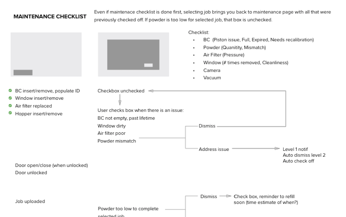
Finally, I translated these flows into UI mockups, following the design system I had developed for rest of the UI.
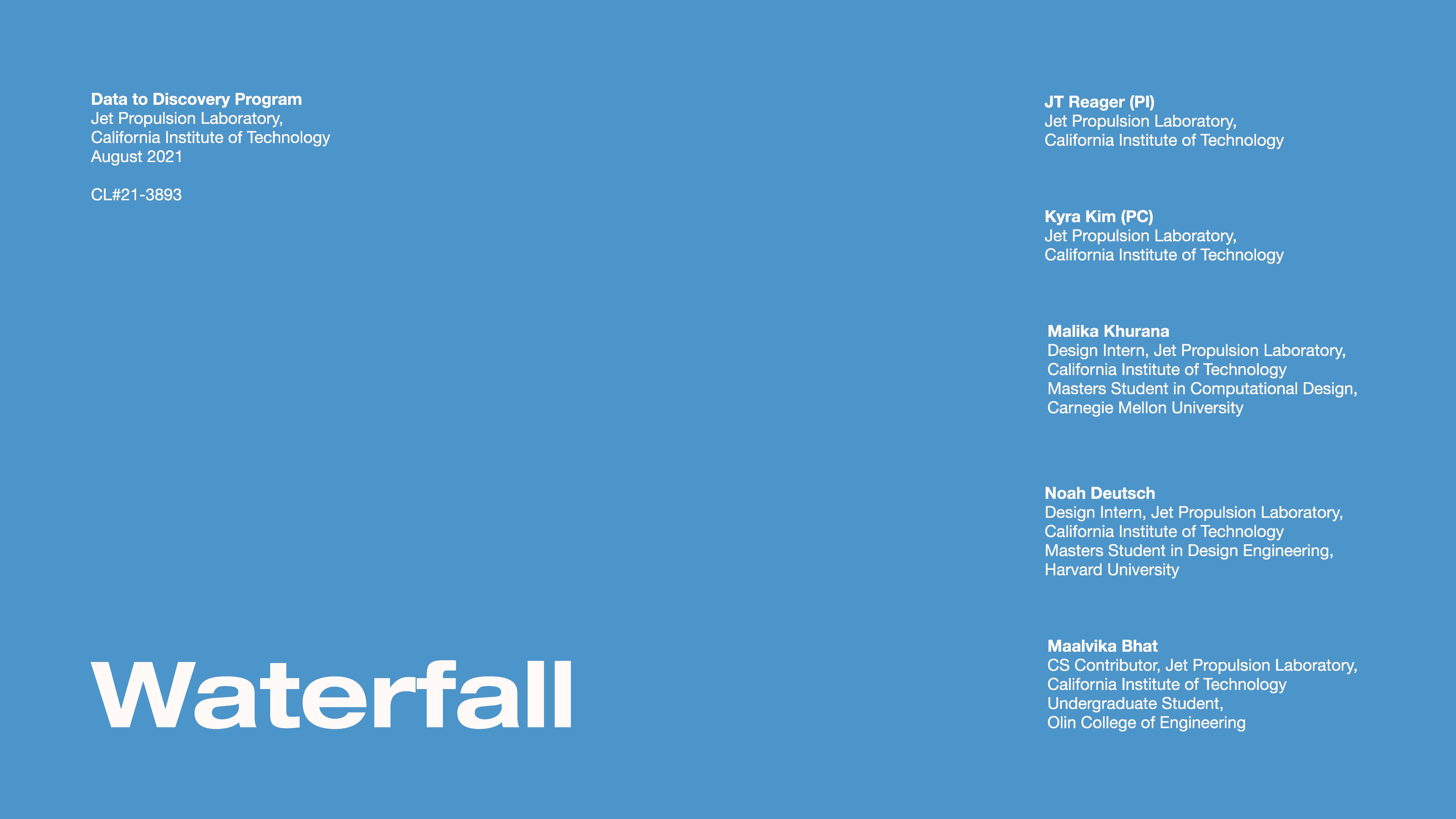
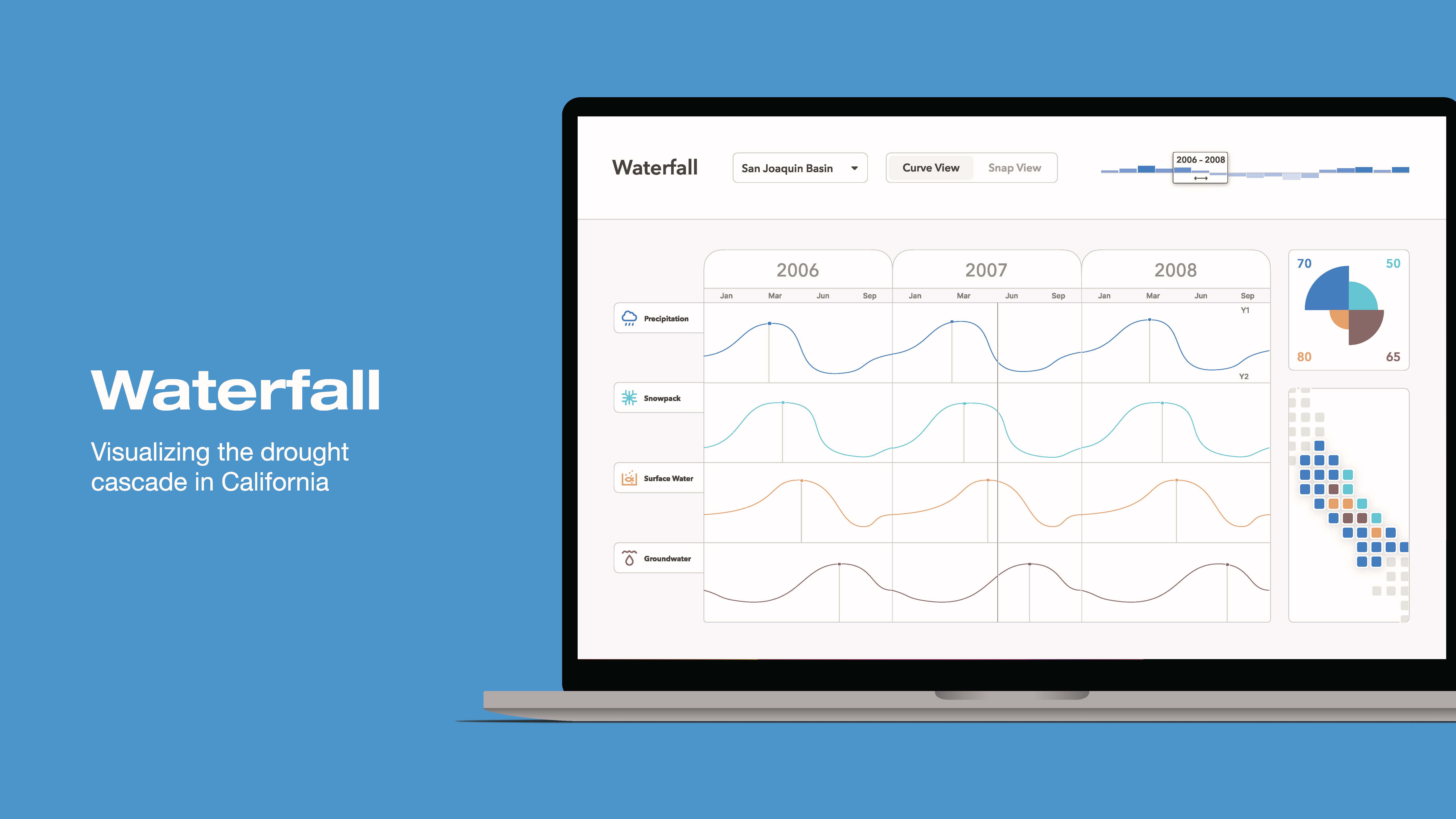
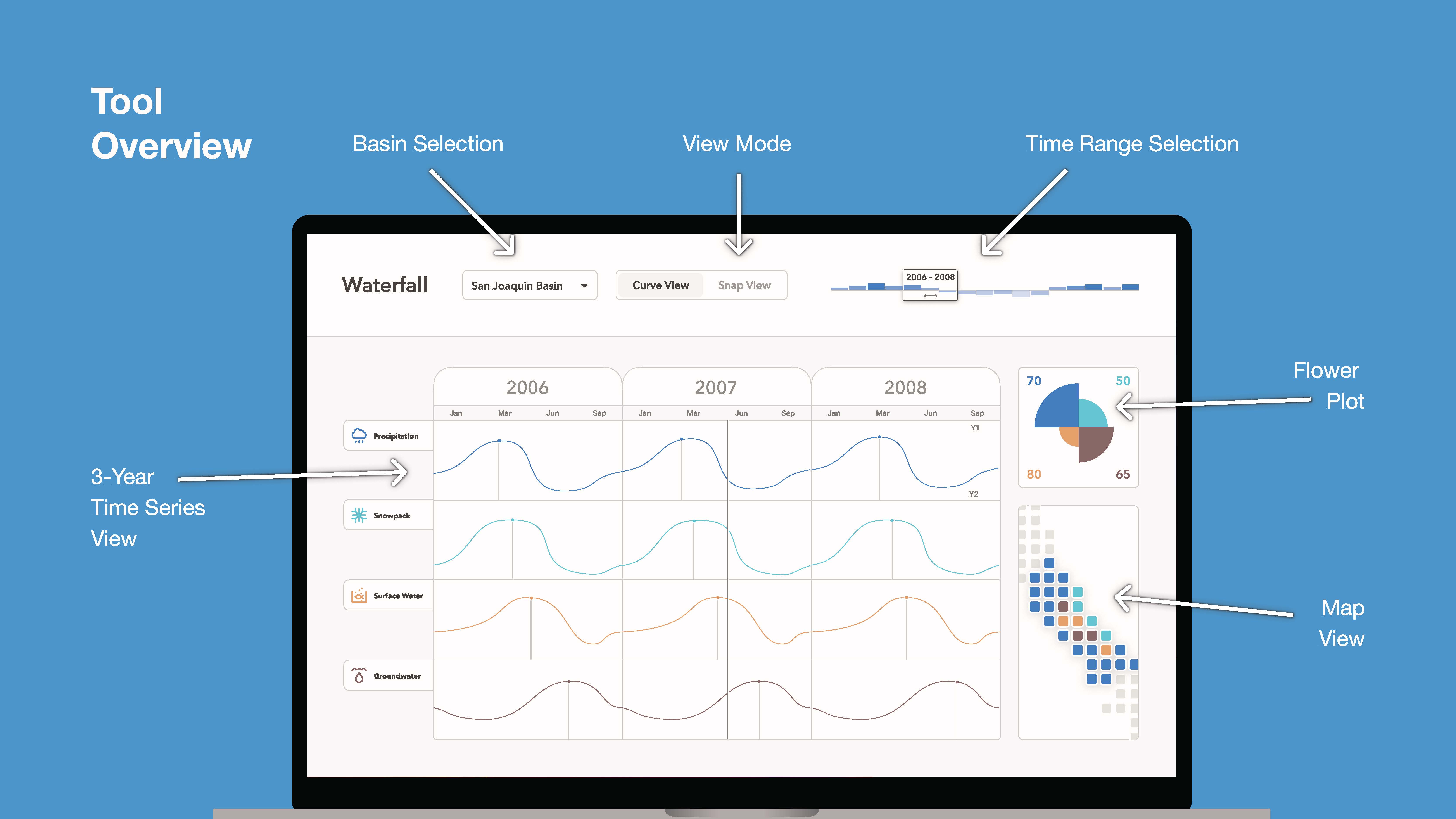
Waterfall: Visualizing the drought cascade in California
2021
data collection, data cleaning, contextual inquiry, wireframing, concept design, ux design, front-end development (p5.js)
data collection, data cleaning, contextual inquiry, wireframing, concept design, ux design, front-end development (p5.js)
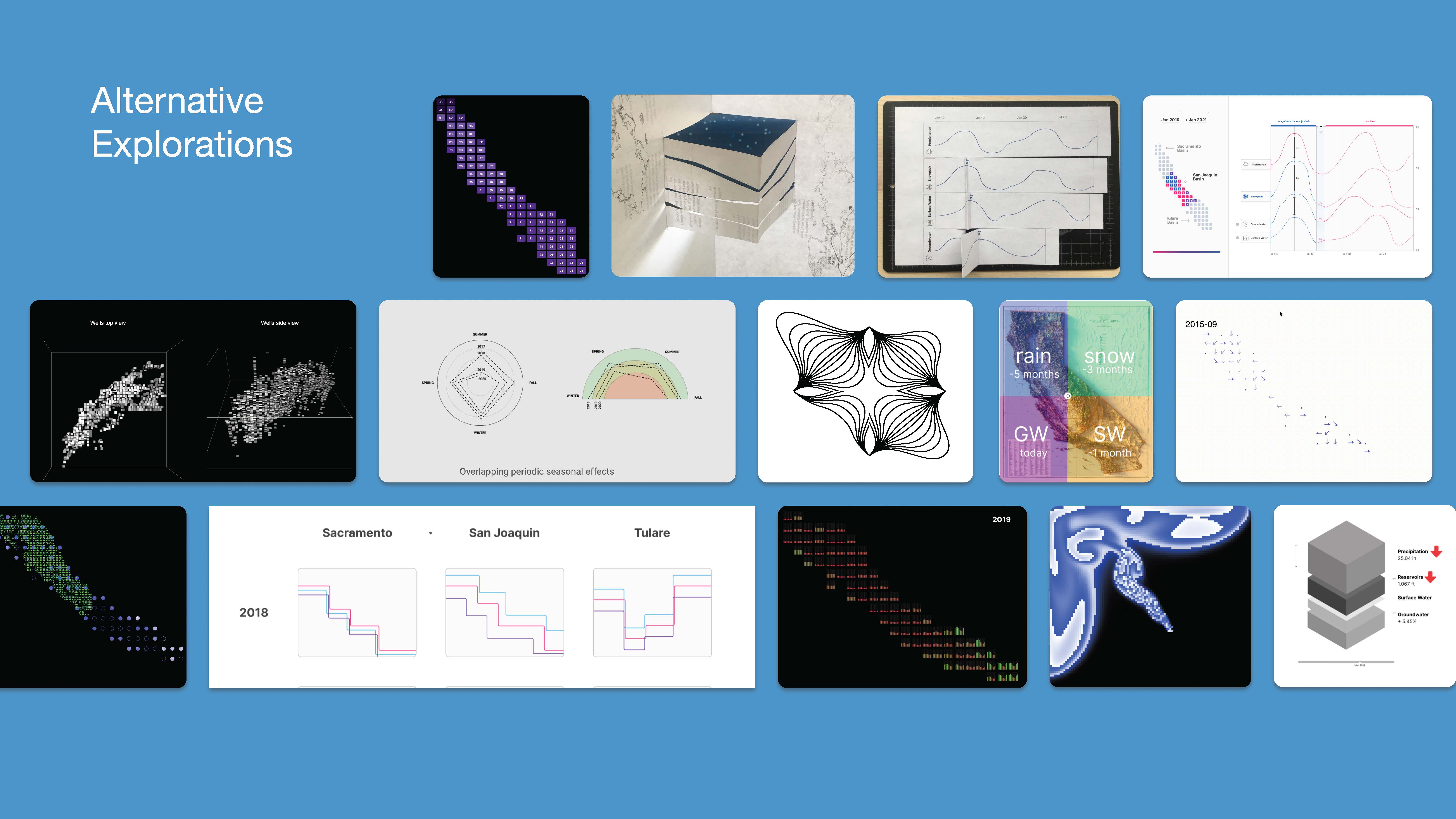
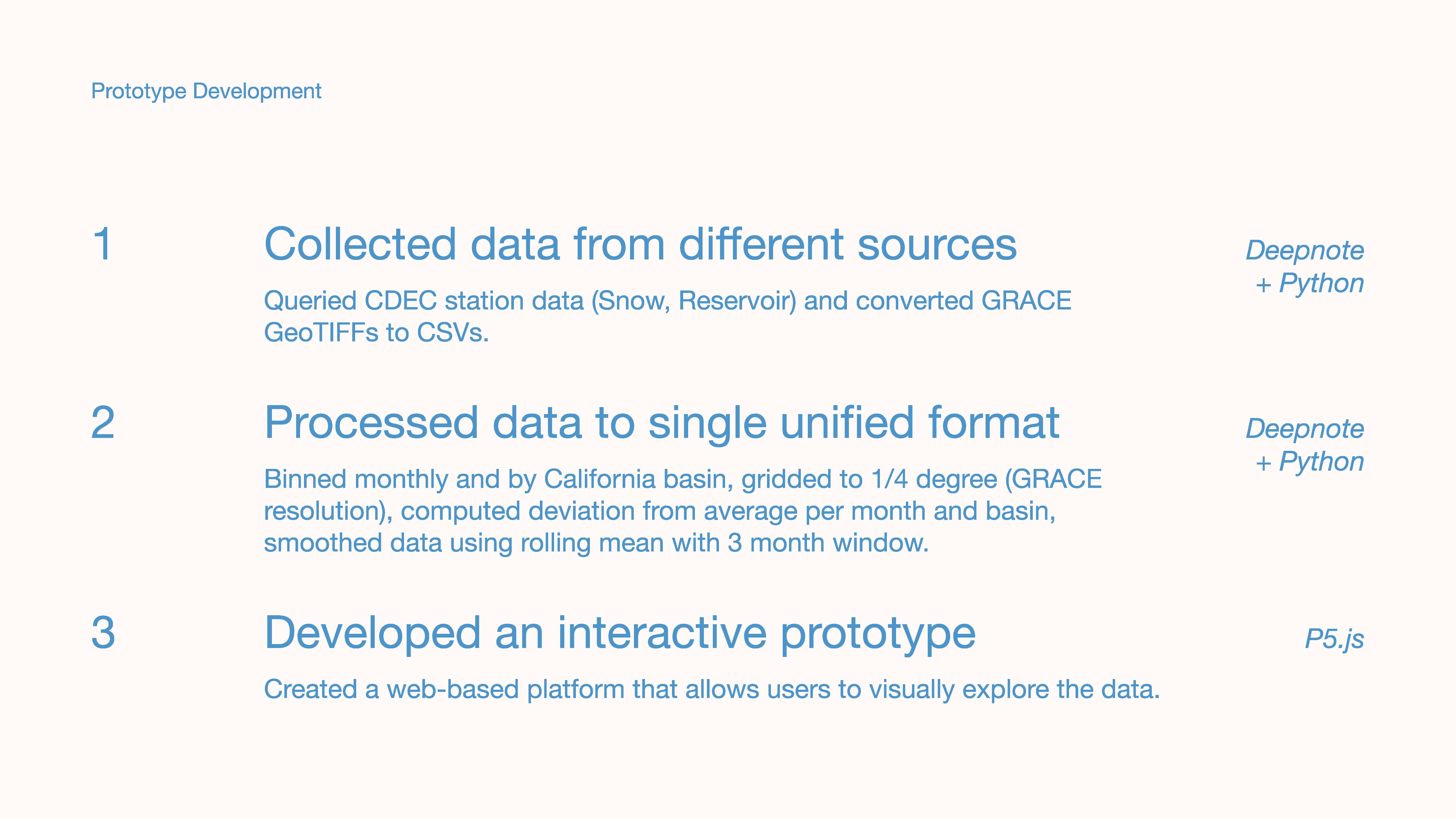
During the summer of 2021, I designed and built a tool for hydrology researchers at NASA’s Jet Propulsion Laboratory to understand the spatial and time-based patterns in California’s water system. Waterfall centralizes multiple layers of hydrology data, allowing users to understand changes across time, magnitude, and space, and build intuitions about relationships that inform future planning.
I handled the data pipeline in Python, and collaborated with another designer through the Data to Discovery Program to develop the visualization concept and build the front-end prototype using p5.js. You can explore the tool live.