Pocketo
December 2016
concept, user research, industrial design, ux design, engineering
concept, user research, industrial design, ux design, engineering
A self-driven project that integrates shape-change interfaces, the Internet of Things, and design for wellbeing. Continuing an interest in communicating information through physical objects. Created in-residence at Studio PSK.
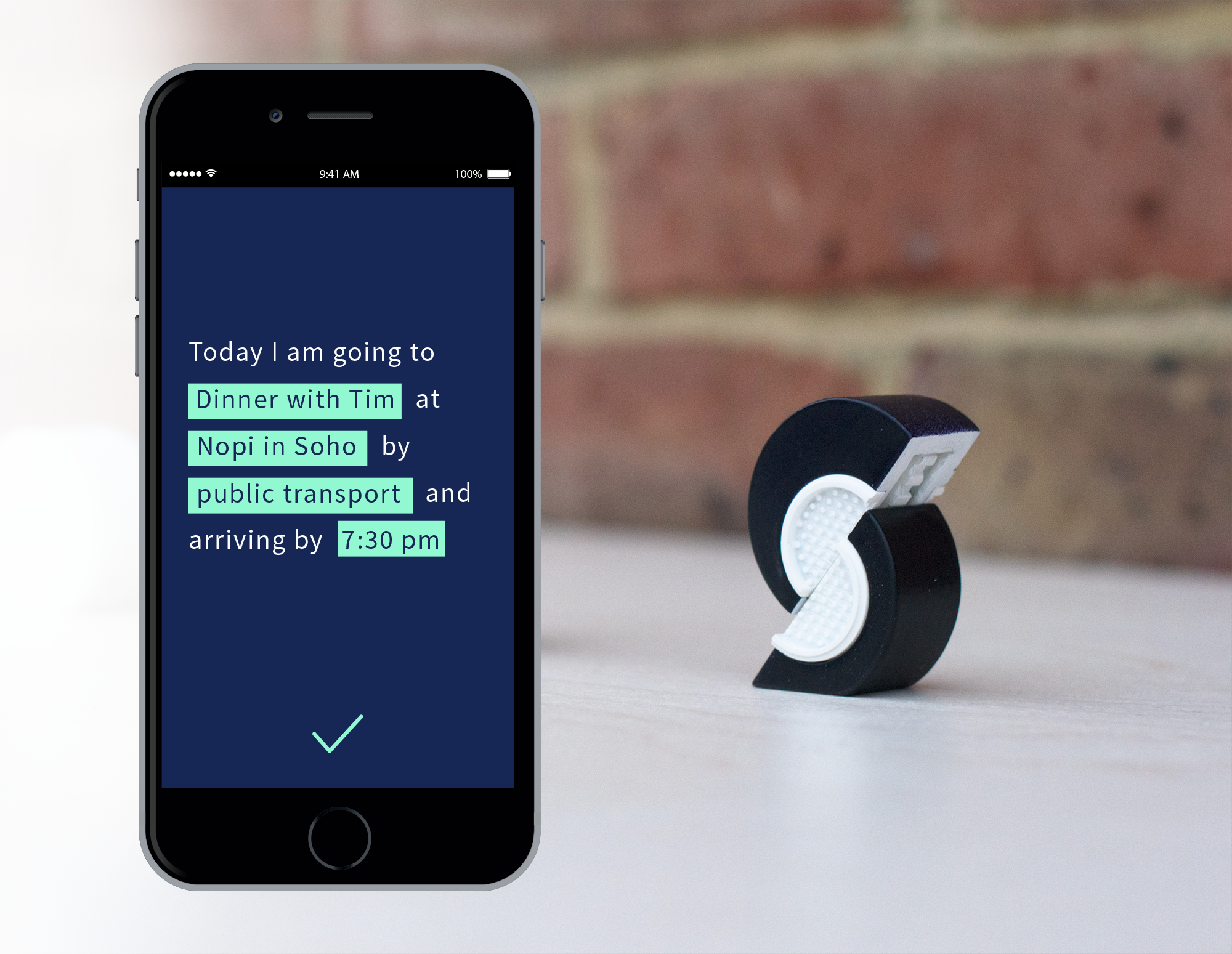
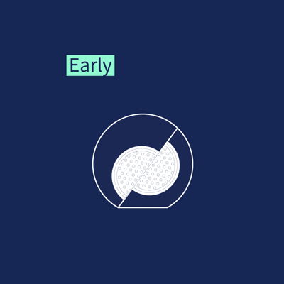
A calming IoT device that tells the user if they are early, on time, or late for their next event thought the alignment of two volumes. The user discreetly gets information from Pocketo just by feeling it in their pocket or placing it on a table.
Context
- Our interactions with technology have broken out of the screen - explosion of IoT, voice-user interfaces, and wearables in recent years
- Certain information actually becomes more immediately meaningful and accessible when communicated say, by feel — especially as our screens grow increasingly crammed with stimuli
- Technology increasingly allows us to automate "low-quality" interactions like logistics of time + transportation
- With IoT: collect data and update software while hardware endures
Research
Through observation, user interviews, and general cultural research, I developed the following insights, personas, and scenarios.Insights:
- When we're stressed, we only want to know the most essential information: are we on time?
- There is somewhat of a grey area with what "on time" means. Rather than being a discrete point in time, it actually means a window of time from roughly 10 minutes early to 3 minutes late.
- Many users check the travel time in advance, then add about 5-10 mins to back-calculate when they should leave.
- We tend to check the time quite often without realizing it, many times just finding reassurance in touching our phones and craving the tactile.
- Societal standards say it’s rather rude to check your watch (or phone) while talking to someone.
Personas:
I found that users largely varied on two metrics- awareness of time and ability to act on it.
- Optimistic crammer - These chronically late people are convinced they can squeeze in much more than is possible before they have to be somewhere. Liked grabbing a coffee and making the train.
- Lost track of time - Others simply get caught up in what they're doing or get stuck in a conversation and forget when they should leave.
- Punctual but anxious - These users are fine with managing time, but find it to be a great source of anxiety that they could spend less time worrying about.
Scenarios:
- The user goes to lunch, gets caught up in conversation, and forgets they were supposed to leave at 2 pm.
- The user forgets something inessential at home, but decides to run back and get it
- The user decides they should allow 40 minutes of transportation time to get to their meeting, but go out for an impromptu walk, leaving them an extra 10 minute walk away from the train station.
Designer Giorgia Lupi tracked how often she checked the time and confessed, “when in a hurry together with my boyfriend, I asked him not to tell me what time it was on several occasions, saying ‘just tell me if we’re fine’ instead.”
Alongside these insights, I began thinking about how physical objects communicate information, what kind of objects people hold for reassurance, and what symbols of time are universally understood.
I developed a set of product specifications based on this research and my interests:
- Connected physical device
- Minimal - distill complex information into the most necessary and useful message
- Intuitive - users understand what it means without an instruction manual
- Discreet - can be “read” just by touching your pocket
- Tactile - communicate information by feel
- Soothing - compact, weighty, lends itself to repetitive action
Process + Decisions
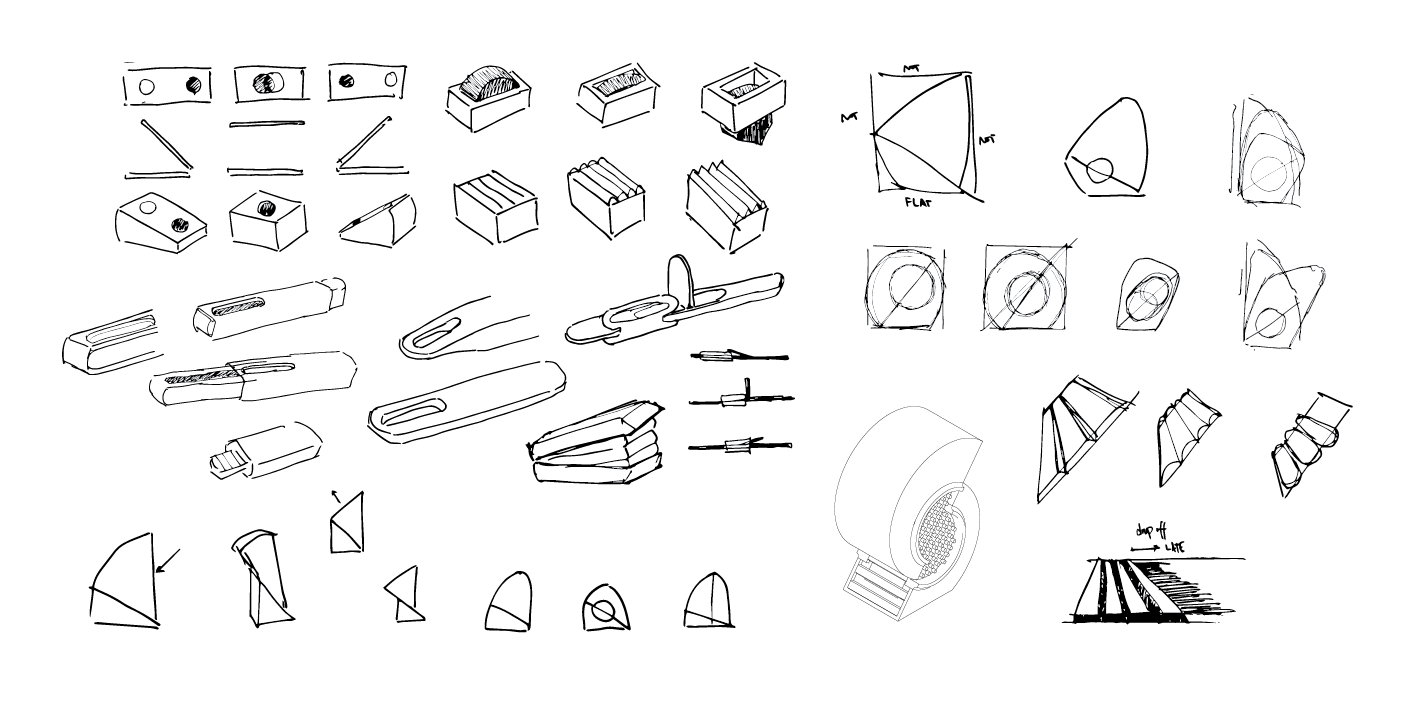
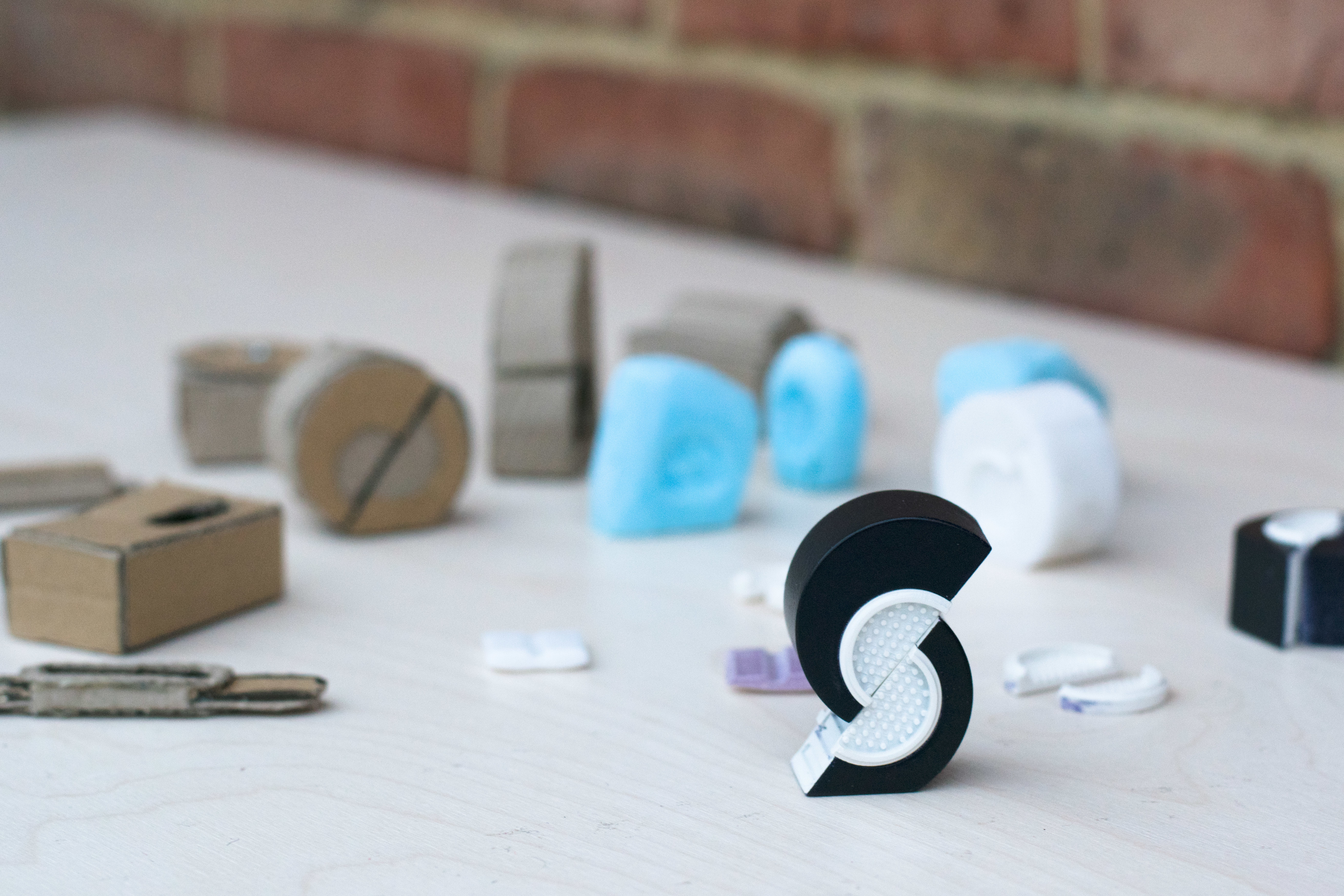
I decided to physically represent different "time states" (early/on time/late) through the relative position of two volumes that would make up the product. I used Processing, Illustrator, Rhino, foam, cardboard, and good old paper + pen to explore specific forms, settling on the slashed-circle shape because it references common symbols of time and sits well in the hand/pocket.Through use scenarios and storyboarding, I determined what information was most important for the user to know at different points in their journey. I used these insights to design layers of information into the textures and features of the physical form, including the inner/outer circle alignment and the tip-over alert function.
Tactile Interface
Pocketo communicates subtly through touch, providing a calming tactile experience as an alternative to awkwardly checking your watch mid-conversation, repeatedly checking the time on your phone screen, and anxiously holding onto your phone for reassurance.Information Hierarchy
From feeling the shape of Pocketo in your pocket, you can immediately tell- whether you need to even worry about the time,
- if you're on track or running late, and
- just how late you are (and potentially how to fix it).
Center of Mass
Let's say you're at lunch. You put Pocketo down on the table, get caught up in your conversation, and don't realize when you should have left for the movie you wanted to go to. When you reach the tipping point of being almost-late, Pocketo alerts you by, well, tipping over.Calendar + Location = No Stress
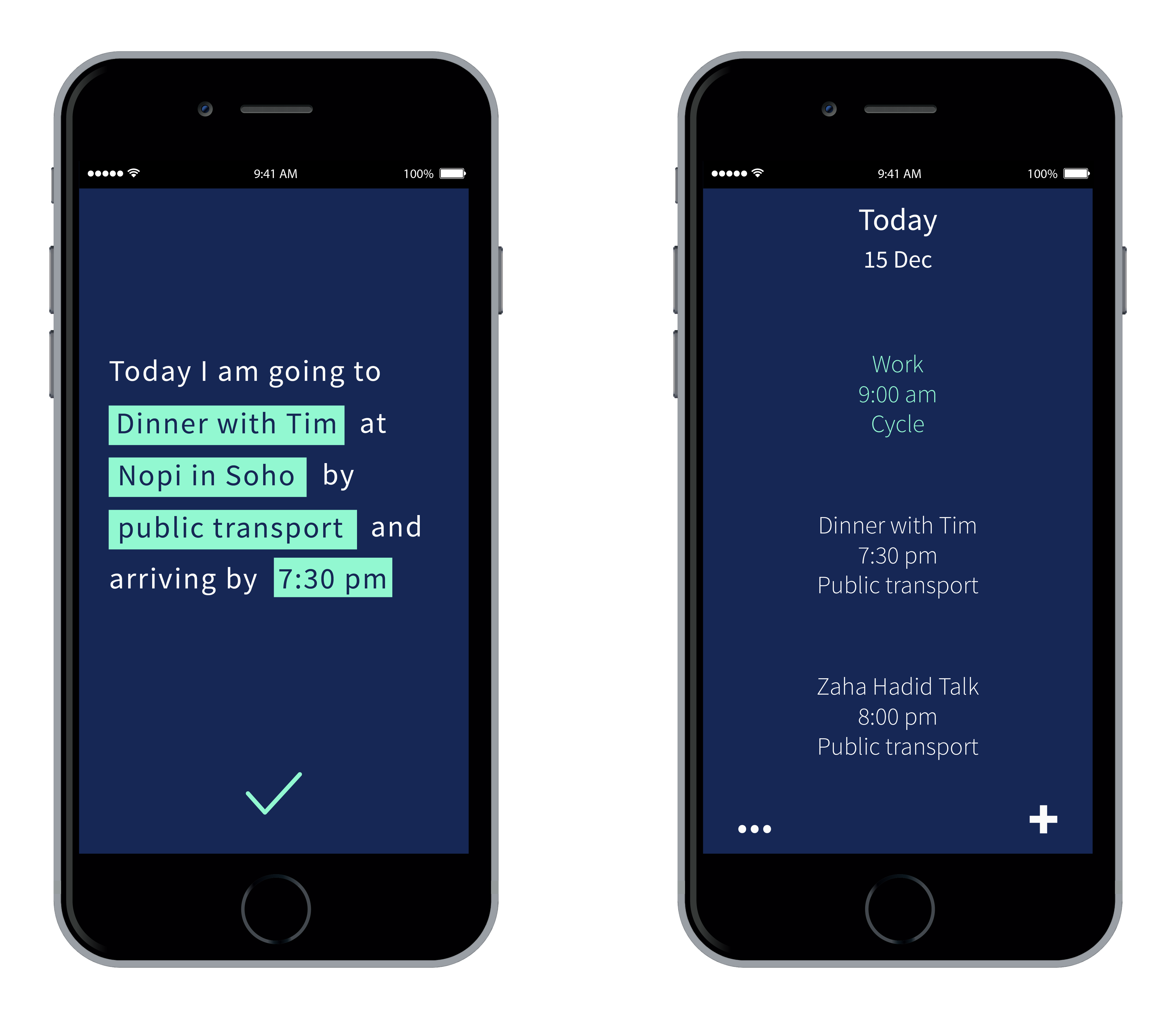
Pocketo pairs with the calendar on your smartphone to automatically import the events you might already have scheduled for the day. From the Pocketo app, you can decide which of these events to track and add new events on the fly. The app allows you to separately input daily recurring events, like getting to work on time.Using this event data and your location, Pocketo calculates when you should leave point A to get to point B - so you don't have to sweat the small stuff.
Engineering
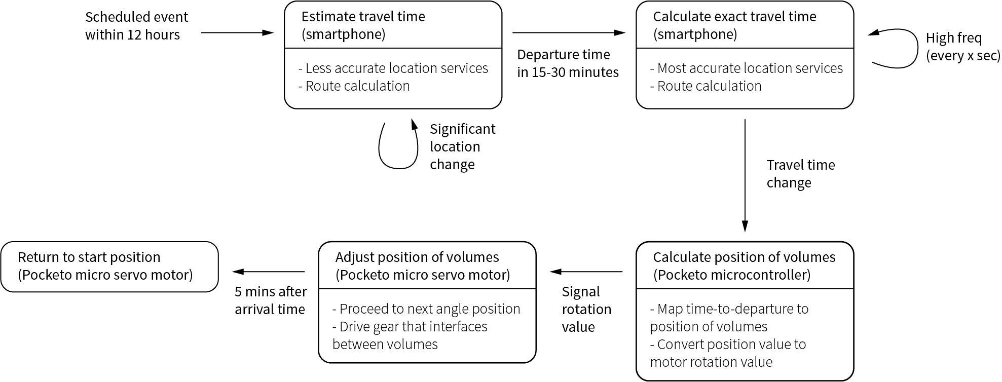
Pocketo would require a microcontroller and bluetooth low energy chip to pair with your smartphone, and a micro servo motor to adjust its position. The smartphone handles GPS location tracking and route calculation, while the Pocketo microcontroller simply calculates the relative position of its two volumes based on time-to-departure. This position value is sent to the motor, which drives a gear in one volume, using the texture on the other volume’s face as a gear track.In the hours leading up to a scheduled event, the app will roughly estimate the necessary departure time, refreshing the estimate only when there is a significant location change (to improve energy efficiency). Closer to the departure time, the app will activate location services and recalculate the route more frequently.
Results + Takeaways
Pocketo's tactile interface combines UX and industrial design to explore a new area of "physical information architecture," providing an alternative to 2D GUIs and many lessons to carry forward:- Information objects are best suited to communicate simple messages quickly and intuitively. In the information hierarchy of a physical object, levels of increasing detail are more distinct, harder to sequence and transition between (all parts of a physical object are accessible at once) compared to its digital analogue.
- Material qualities and kinetics are key. Like color in GUIs, materials tell us about an object — with the added subtleties of texture, warmth, weight, cultural connotation, etc — while kinetics allow us to “navigate” to other states.
- Reference the familiar. It's like skeumorphism for the Internet of Things - we're creating a new paradigm for tactile interactions that users should understand without explanation. The design of information objects should riff off what we already understand about everyday objects (for example that a wide, shallow bowl isn't good for cereal) and they should likewise also be objects that we want to own and identify with.
See more on my process and others' reactions via Medium.
