Bakery Multi-timer
2017
contextual inquiry, ux design
contextual inquiry, ux design
For a few months in 2017, I worked as a pastry chef at a bakery in Cambridge, MA. I became fascinated with the systems, products, and friction points of this world - one of which was our digital multi-timer, which tracked multiple goods baking in the oven at once.
Challenge
Create an intuitive and quick-response timer to track multiple items baking at once in an industrial kitchen.Context
- Voice UIs make inputting information and retrieving short, contained facts much easier, especially in messy environments like the kitchen.
- There's a smartphone in almost everyone's pocket, with the potential to be organized into a system of communicating devices in a team setting.
User Research + Task Analysis
As a designer working in a bakery, I was able to really get in the mind of my user, and understand the strengths and weaknesses of the existing solution for tracking multiple different bake times at once.
Based on this audit of the State of the Art, I sorted each function of the "dream timer" into one of three modes: RUN, ALARM, or SET - then marked each as HIGH, LOW, or MID priority.

I noticed the flow of actions dependent on the timer was pretty much the same each time:
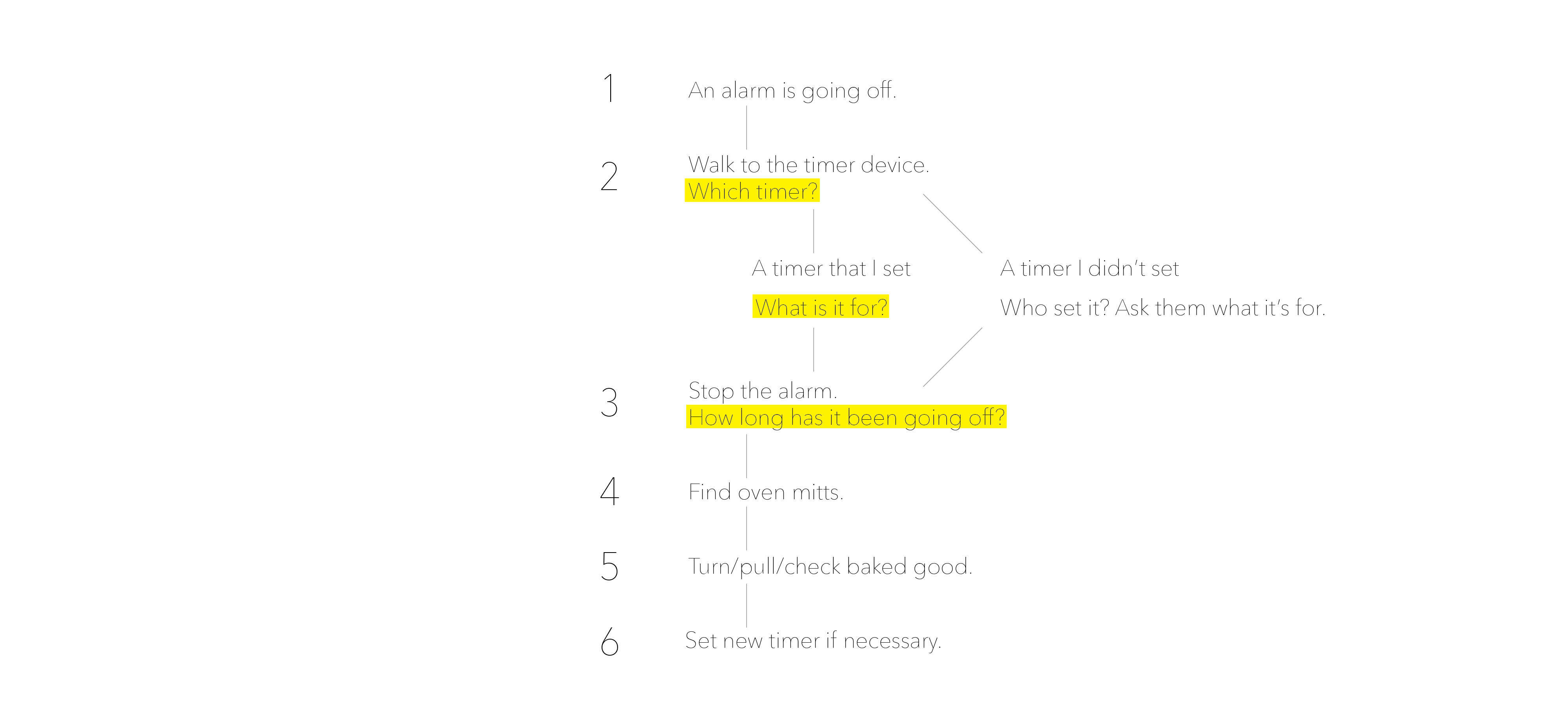
Studying this flow and observing on the job led me to the following special use cases (when things don't go as smoothly as numbers 1-6).
1. The timer has been going off for some unknown time, and I only just heard it.
2. Another timer for Baked Good 2 goes off while I'm dealing with Baked Good 1.
3. I forgot what the last timer I set was for.
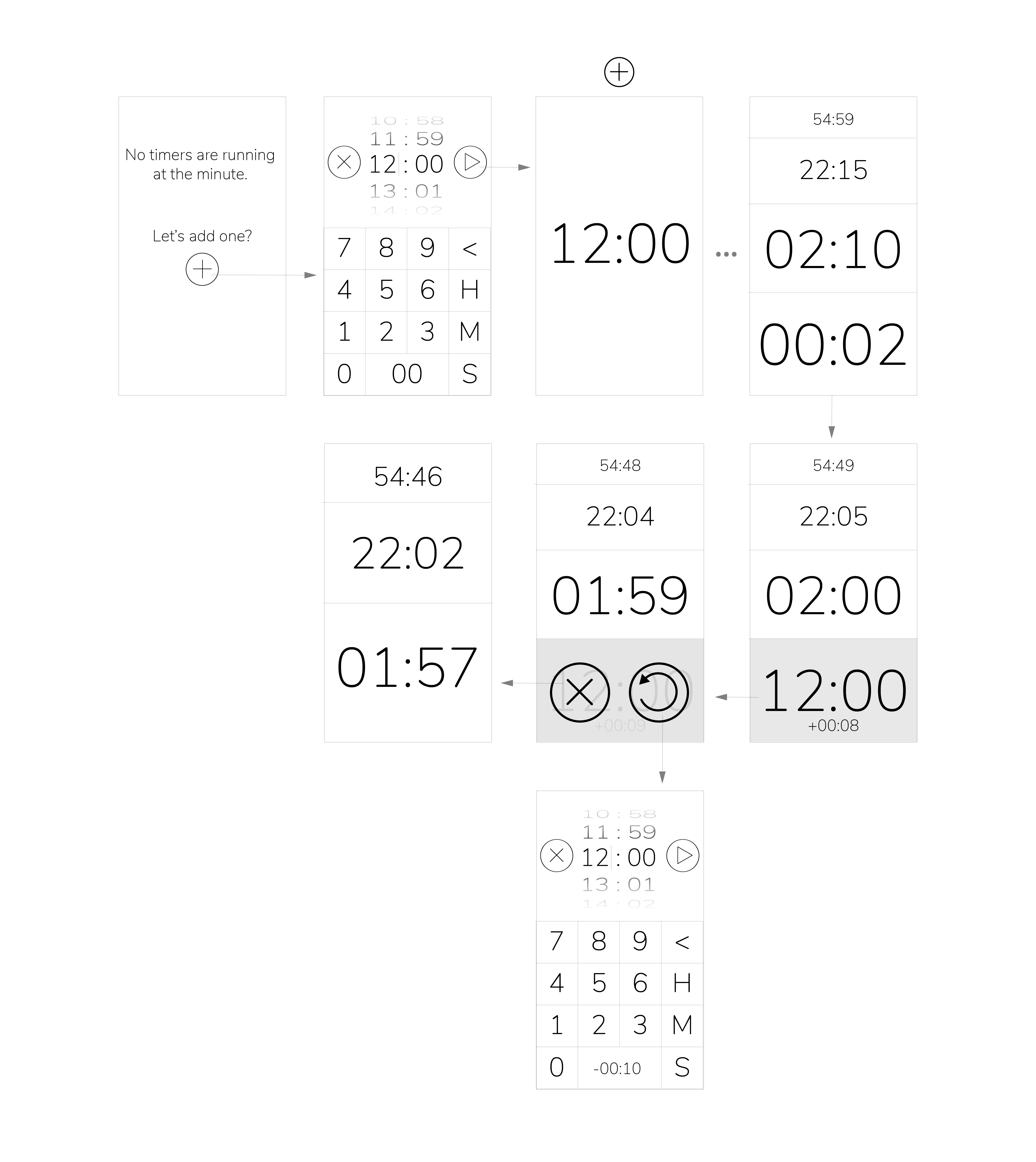
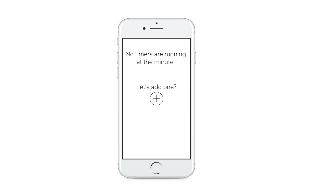
The ideal interface would incorporate voice-input to set timers, and a visual display giving an overview of all the timers running at a glance. I started by focusing on a purely screen-based version, designing the simplest possible interface that would still fulfill the desired specs, with plans to explore more compelling and intuitive visual metaphors as I got a better handle on the functionality. Though I considered a circular or hourglass-like interface, I found these detracted from the functionality, so the best visual to start with was the numbers themselves.
I also began experimenting with quick, tactile ways to shut off the alarm using the accelerometer, like bumping or slapping the phone. A smartphone is much more capable but also more valuable to the user than a standalone plastic timer, so I chose to incorporate non-screen-based interactions, in the case the user's hands are covered in dough.